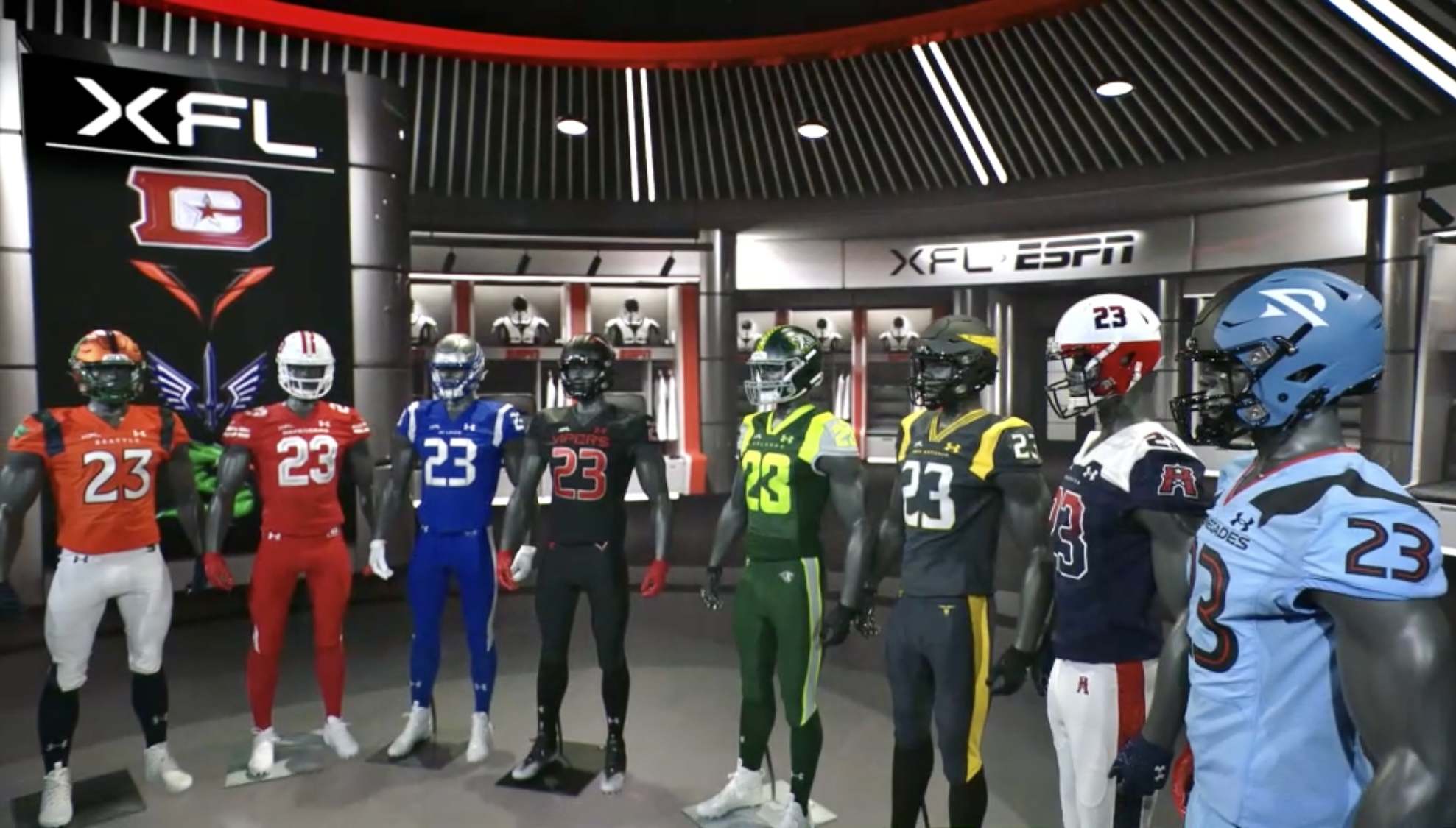
XFL 2023 revealed on Wednesday the uniforms for all eight of their teams on ESPN’s SportsCenter. The league’s official outfitter, Under Armour, designed the XFL’s new looks. The league will kick off its 2023 season Saturday, February 18th, on ABC, ESPN, and FX.
Exciting day unveiling our NEW @XFL2023 uniforms by our official XFL partners @UnderArmour @ProjectRock
— Dwayne Johnson (@TheRock) December 8, 2022
I’ve known @DanyGarciaCo since I was 18yrs old and years later, here we are 🙏🏾
Thank you to our great partners @Disney & @ESPN for the aligned vision. #grateful #54 pic.twitter.com/DnqWCytpqH
Ranking League/Team Uniforms
Ranking any league or team uniforms is a subjective process. There’s no right or wrong, and it comes down to personal taste and preferences.
Any new or upstart leagues have a challenge trying to avoid mimicking established sports team brands. Especially as it pertains to football; after all, there are nearly 800 college football universities. Combining that with high school and pro teams worldwide. There have been thousands of different football teams with similar names and color combinations that have been in existence.
Because of that, new leagues walk the fine line of trying to look like the rest of the crowd and fit in while also trying to be different and present something bold or unique. You can miss the mark by leaning too heavily into either approach. Pleasing loyal returning fans and avoiding ridicule from casual observers is almost impossible in this space.
XFL 2023 Versus 2020 Brands
The XFL’s unveiling of their team uniforms is unique because the revived league already had established brands and trademarks. XFL 2023 is bringing back, with some tweaks here and there, seven of the team names from the 2020 iteration. Albeit, some are in entirely different locations. (Guardians in Orlando, Vipers in Vegas)
It’s a bit different than the USFL’s adoption of brands and logos from four decades ago. But the XFL could’ve easily just copied and pasted the returning brands from 2020 that had widespread acceptance. So, making any changes is a brave choice because you risk upsetting returning fans in St. Louis, D.C., etc.
In fact, within hours of the XFL’s uniform unveiling, one Battlehawks fan, broadcaster Clint Hargrave has already started an online petition to bring back the glorious sword/wings combo helmet from 2020.
@XFLBattlehawks fans make your voice heard. Sign the petition to bring back the best helmet in XFL history. #kawisthelaw #Battlehawks @TheRock @Anthony_Becht @the_markcast @XFLNewsHub @xflaccess https://t.co/RI5PWfxU2g
— Clint Hargrave (@ClintHargrave) December 8, 2022
There are predictable instances like this already from die-hard XFL fans of two years ago. Some Defenders fans want their shield back. Dragons fans miss their original dragon logo. Renegades fans miss the Renegade on their helmets. Roughnecks fans who loved the P.J. Walker-adorned uniforms are going through an adjustment period right now. Houston has taken a few different turns with their new look. As has the entire look.
So with all that out of the way, here are my personal rankings of the XFL 2023 team uniforms, from worst to first, complete with 2020 goggles.
Ranking The XFL 2023 Uniforms From Worst To First
#8: Orlando Guardians
Got our checklist Coach @27tbuck,
— Orlando Guardians (@XFLGuardians) December 7, 2022
✅Stand guard
✅Light up that scoreboard
✅Bring that championship home
In THIS uniform. 👏#XFL2023 pic.twitter.com/wxUkyy8Lvr
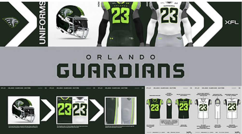
It was going to be an uphill battle for this XFL 2020 brand to garner acclaim in Orlando. The New York version was one of the XFL’s best team looks and concepts in 2020. Not helping matters for the Orlando outfit is the risky choice of incorporating “hyper green.” It’s been done before, but the margin of error is tiny in making that shade of green work.
The Orlando combination of forest and neon green works fine on the new Guardians helmet. But it’s a miss on the uniforms because of the incorporation of a light gray on the pants and shoulders, which mutes the vibrant “Hyper Green.” The overall look stands out. And perhaps in the Orlando sun, the uniforms can be enhanced when in action. But even the usage or lack thereof of the team’s predator/lion leaves much to be desired. Nothing is menacing about the new Guardians.
#7: Seattle Sea Dragons
The squad approves 🫡#XFL2023 pic.twitter.com/ZIEQ93LEzw
— Seattle Sea Dragons (@XFLSeaDragons) December 7, 2022
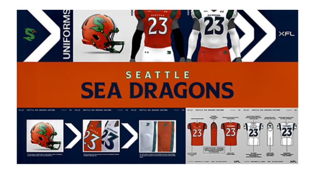
On the positive side, the Dragons’ new metallic helmets are sharp looking. The nod to the emerald city with the team’s scaling pattern is a nice touch. The design goes all in “fire orange” on their home uniforms but virtually abandons it in their away jerseys. The color combinations are something that football fans are undoubtedly familiar with, and the Miami Hurricanes instantly come to mind. But this overall look pales in comparison to that.
The Dragon concept can be an entertaining brand to embrace. The changes that were made to the team logo in 2020 were unnecessary. The same can be stated about the team’s altered name. Seattle had a chance to be one of the coolest-looking brands in the league. Like it was in 2020. But for me, the 2023 version is a miss.
Fearlessness at full throttle.#XFL2023 pic.twitter.com/7X62SZoD9S
— Arlington Renegades (@XFLRenegades) December 7, 2022
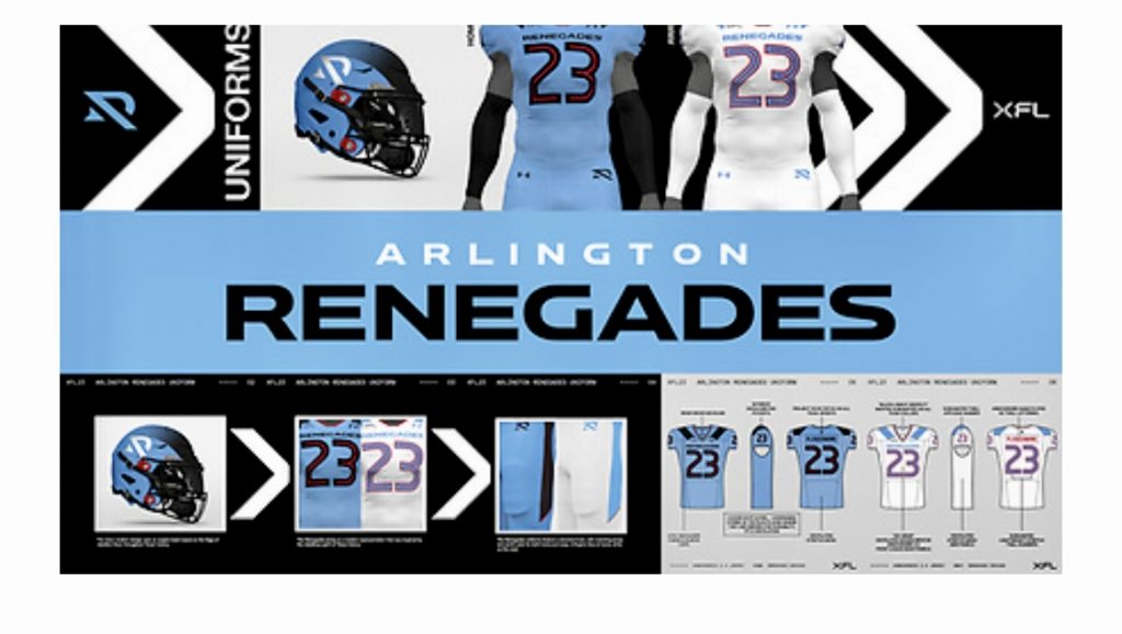
Less isn’t always more. The new understated logo pales in comparison to the team’s original Renegade. Like the Dragons in many respects, the color combinations are workable. But outside of the team’s matte blue helmets, which include a black angled slash inspired by flags of rebellion. The Renegades’ new look is neither bold nor defiant. Arlington’s uniforms are leaning into a more simplified design. The overall design isn’t bad. It’s just dull.
#5: St. Louis Battlehawks
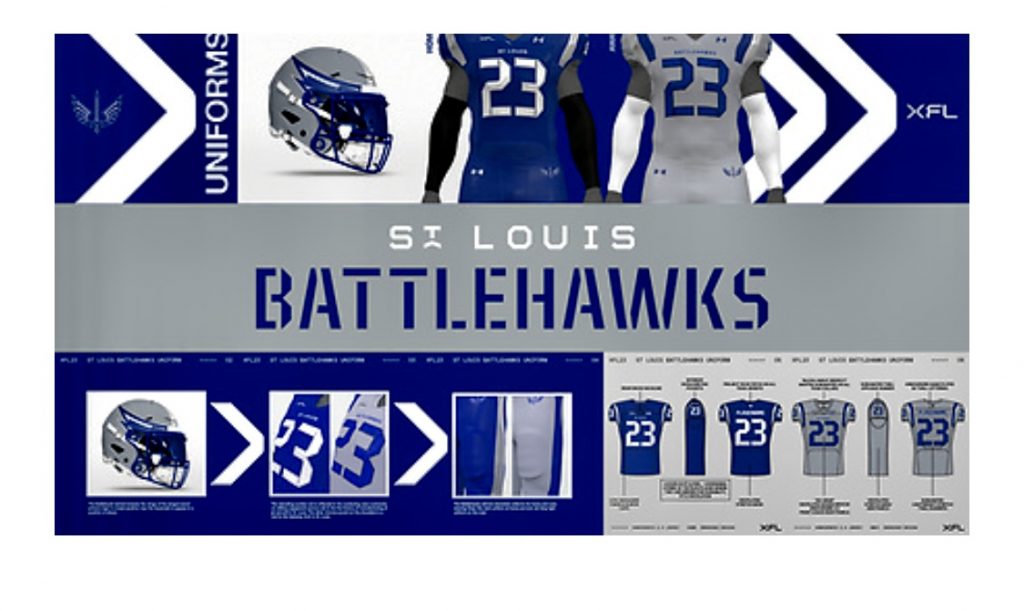
Coach @Anthony_Becht said it best- "This is gonna be the go-to uniform for the XFL." #XFL2023 pic.twitter.com/wCcVJzS4w4
— St. Louis Battlehawks (@XFLBattlehawks) December 7, 2022
The Battlehawks’ colors and uniforms are satisfactory overall, and the deep sky blue and jet gray colors are an excellent nod to the team’s aerial concept. There are also some lovely subtle details if you look closely enough, like the numbers’ stenciling to the silver chrome accent on the shoulders that resemble the Gateway Arch in St. Louis.
The glaring omission in the updated Battlehawks design is the minimalization of the Sword-Wings combo that graced the team’s beautifully styled helmets in 2020. The new Battlehawk helmet includes the wings of the winged sword without the latter. Even the 2023 version of the wings is a lot more subtle now than in 2020. I can see the reasoning behind tweaking the winged sword, but eliminating it is rightfully meeting resistance.
If there was ever a time for Under Armour to embrace a third alternate look for XFL teams, this is it. NFL teams have finally embraced alternate helmet options, and the XFL should consider doing the same in the near future.
#4. D.C. Defenders
.@EricDungey said it best, "look good, play good." 🔥#XFL2023 | @reggiebarlow pic.twitter.com/um2ZM3oYxB
— D.C. Defenders (@XFLDefenders) December 7, 2022
Like the Battlehawks, D.C. has decided not to incorporate one of its best design concepts from two years ago. The Defenders’ brilliant shield is gone.
However, unlike some of their other returning counterparts, the Defenders’ overall tweaks are an upgrade from 2020. Beginning with the team’s pretty white helmets incorporating a grey camo design. The glow-up stands out in the Defenders’ away uniforms, and the fatigue combination on the jerseys and helmet in the road look is stellar. Combine that with the usage of stars throughout, and you get an excellent pro football team look.
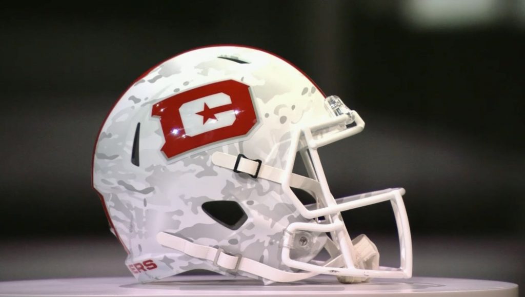
Unfortunately, the fatigue pattern doesn’t carry over to the home uniforms: a missed opportunity and a sign of inconsistent design choices throughout the league. The Defenders are one of only two XFL teams with a single X on their helmets rather than having the full league name. Not sure if there is any reasoning for that diversion, but it’s the incomplete nature keeps this from being an overall winner. The Defenders could also benefit from having an all-white look used during the season.
#3. Houston Roughnecks
“They’ll look good in them” yes coach, yes they will. #XFL2023 pic.twitter.com/NlHMu2VmXh
— Houston Roughnecks (@XFLRoughnecks) December 7, 2022
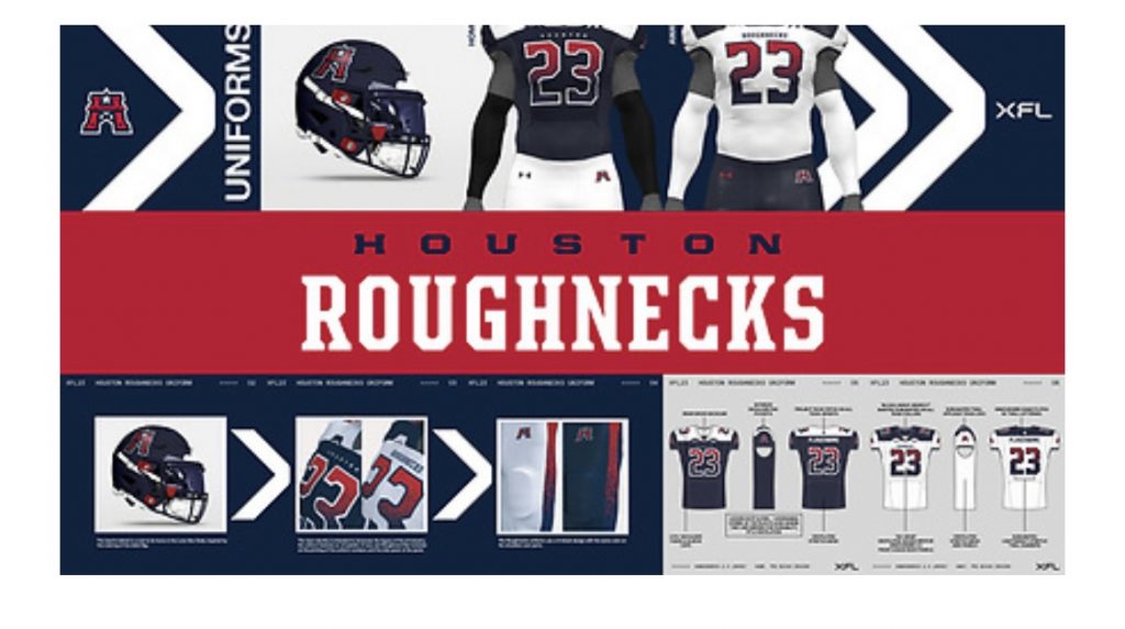
The Roughnecks’ new look is, without a doubt, the most polarizing of the XFL bunch. For some, the complete departure from Houston’s 2020 design was unnecessary. For others, the Roughnecks have hit a home run by taking the bold route.
For anyone who has followed the tribulations of the Roughnecks brand and its contentious copyright infringement history. You had to know changes were on the horizon. But even still, perhaps not to the extent of what was revealed on Wednesday.
Where does one start? The Roughnecks have modified their H-lettered oil rig logo. There are still hints of the wink-wink Oilers-inspired rig, but it’s less subtle this go-round; what isn’t subtle if Houston’s new helmet? A three-tone split design inspired by the coloring of the state flag. On one side is the newly revamped logo; on the other is the player number. The oil splatter navy/red tri-block design on the numbering, shoulders and side panels of the jersey pants is a clever design feature.
Curiously, the Roughnecks’ have their team name on the front of their away jersey but not on their home look, which features the city name instead. Some people will not like their deviation from the old Roughneck look. Understandably, but I like the originality and execution of the 2023 concept. Maybe the league can incorporate an updated replica look in the future. Provided that it doesn’t get them in legal trouble with NFL properties again.
#2. Vegas Vipers
"You can’t even see the strike…until it's too late." -Coach @RodWoodson26 #XFL2023 pic.twitter.com/KF8fPoU9Id
— Vegas Vipers (@XFLVipers) December 7, 2022
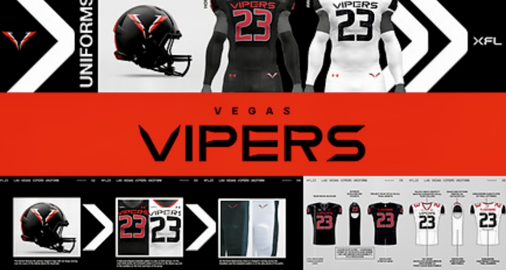
Just my personal opinion. But for what it’s worth. The Vipers brand is one where I can clearly state that it’s much better than it was in 2020. Every bit of it, from the overall coloring to the design details. The snake concept is fully embraced.
The Viper helmets are sleek and fierce looking. The red fangs coming over the crown of the helmet are a nice touch. The diamond-shaped snakeskin pattern throughout the jersey and pants is terrific. The collars are the one missed opportunity in a stellar overall design. Perhaps Under Armour didn’t want to overdo it, but they could have utilized the V fang concept in the collar of the uniforms. Notably missing from the design is the Vegas name. Although the logo looks like a double V, some tip of the hat to the city, even in name, would’ve been fantastic. Perhaps the team name on the jerseys is a bit too overstated, but that’s nitpicking. The XFL and UA hit a home run with the new Vipers. They will look great in these uniforms, no matter where they end up playing. Bishop Gorman or Cashman Field.
#1. San Antonio Brahmas
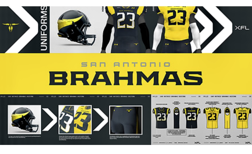
Your favorite uniform's favorite uniform.#XFL2023 pic.twitter.com/geWelXydDS
— San Antonio Brahmas (@XFLBrahmas) December 7, 2022
The lone bull in new XFL team names takes its place atop the league’s uniform designs. It’s hard not to be bullish about the Brahmas’ overall team design.
The colors of dark grey and yellowish gold work perfectly together. The inverted horns logo on the helmets are badass and original. The horn trope has been used in Texas football for a long time. So the XFL found a way to incorporate horns uniquely without looking like a knockoff of other established brands. Well done.
The cracked horn texture on the helmets, sleeves, and numbers is a great choice, and it’s executed brilliantly. The collar design is also very sharp looking. Both the home and away jerseys look great. Like Houston, the Brahmas have their city on their home jersey with the team name on the road outfit.
The Brahamas are the 2023 version of the St. Louis Battlehawks. They have a unique name and logo that is bold. They will be playing in a proven spring pro football market in San Antonio that embraced the original Commanders in the AAF. The Brahmas look great now and will look even better in action under the bright lights of the Alamodome.
Stamp of approval ☑️ pic.twitter.com/vxeLkhbd4Z
— San Antonio Brahmas (@XFLBrahmas) December 8, 2022
Final Analysis On The XFL 2023 Uniforms
Not bad at all. Far from perfect, with some inconsistencies throughout. But overall, for the most part, XFL 2023 got it right. They sailed into the sea of the uniqueness of their team names and brands without going overboard.
Surprisingly, the uniforms weren’t panned by mainstream and casual fans, at least not to the degree these leagues usually get when making this presentation. The go-to insult in the past for any sports team that debuts logos or uniforms has routinely been ” Looks like an XFL uniform.” In the case of the Brahmas and Vipers, you hope future team reveals are compared to their high-end quality.
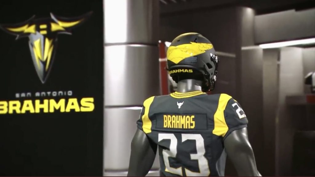
In some cases, the XFL’s top-tiered uniforms are as good as it gets. It helps to have a respected outfitter like Under Armour do the designs rather than some off-the-beaten-path company. It certainly didn’t hurt that UA is a significant time partner with XFL co-owner Dwayne The Rock Johnson. Chairwoman Dany Garcia and Johnson’s fingerprints are all over these team designs. The Blood, Sweat, and Respect mantra shared by the ownership duo is embedded in every team jersey’s collar.
Regarding the brands I have ranked in the lower tier, based on my personal preferences, there’s definitely room for improvement. At the bare minimum, the XFL, through UA, needs to look into adding alternate helmet and jersey looks for each team. The NFL is doing it. So should they. The sooner they do it, the better. The XFL of 2023 should always be open to improving as they journey toward the field of play.
Unleash the Action: Sign up for XFL Insider and Fuel Your Passion for Football!
I am a pro football writer who has extensively covered and reported on multiple leagues over the years. I started covering the XFL back in 2001. You can follow me on Twitter @byMikeMitchell

1 Comment
Leave a Reply
Cancel reply
Leave a Reply
This site uses Akismet to reduce spam. Learn how your comment data is processed.
XFL Kickoff
XFL News Alerts
USFL and XFL Merger: A Deep Dive into the Historic Collaboration
Latest Podcast
-


XFL Podcast
/ 12 months agoXFL-USFL Merger Insights: Houston’s Future, Draft News, Player Movement – Ep. 216
Welcome to Episode 216 of the “XFL Week In Review,” your premier destination for...
By Mark Perry





Dude
December 8, 2022 at 8:49 pm
Worst decision: Making the Battlehawks helmets gray and boring. Bring back the blue and full logo!
Best decision: Houston uniforms, they have an identity and unique style.
I’m pretty blah about the Brahmas. Disappointing jersey for a great logo
1. Houston. Great logo, great colors, unique helmet.
2. Battlehawks, if they get their blue helmet back.
3. Seattle, still a bit of a mess but the metallic orange is cool.
4. Vegas black and red solid but nothing special
5. DC red and white solid but nothing special
6. Brahmas cool logo and name,but asphalt gray with a big blotch of yellow on the back helmet? I think it probably gets boring over time.
7. Arlington, what da blue blazes? Away White is sharp, but that baby blue is a no.
8. Orlando Not Predators but Looks like Predators, dressed in frogman scuba outfits. Away jerseys are ok.