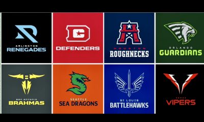
The XFL finally revealed the names, logos, and colors for each team. Overall, fans are relatively happy with the choices. However, we still await the full uniform scheme for the eight-team league.
On the XFL dedicated page on Reddit, readers have offered their suggestions on what the uniforms should look like. Poster StrikeFirst provided a nice graphic of his preferences and they look pretty darn good.

Creation of The Color Rush
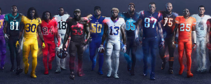
In 2015, the NFL began a gimmick called “Color Rush” for Thursday night contests. The idea was to use creative combinations of flashy uniform colors not used in standard Sunday games. A few were novel and appealing, some were blinding, while others were eyesores, and the worst were flat out vomit-inducing.
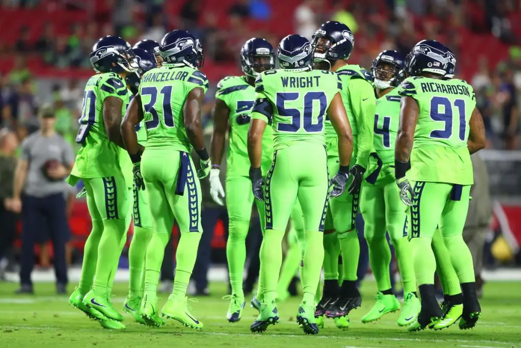
<strong>Pull Down The Shade<strong> 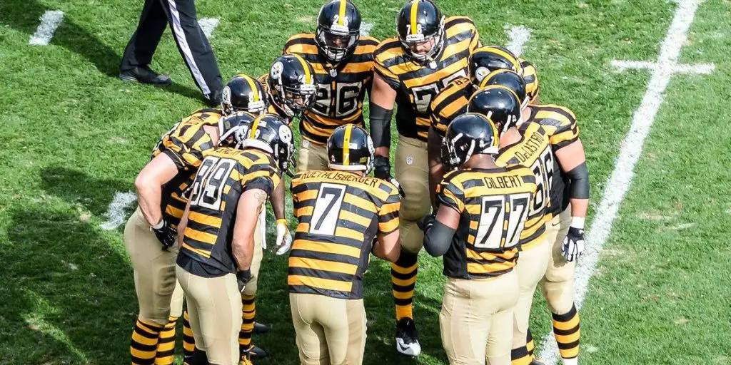
<strong>Escaped Prisoners<strong>
Last season, the league relented to complaints and loosened the Thursday night policy so teams could resume their normal uniform combinations.
Bill Wanger of FOX Sports says alternate uniforms on Thursday Night Football are going away. Hardcore fans don’t need gimmicks to watch. The game schedule will also be stronger. #NABShow
— Jason Barrett (@sportsradiopd) April 10, 2018
However, the concept has made its way into Sunday contests, with some teams wearing an unusual or throwback scheme, while the Redskins vehemently rejected it for their own team.
Watching football should not be about what the guys are wearing. After all, this is a man’s sport; we want action, not fashion. (If you’re really into what the players will be wearing, a detailed description can be found here, with more photos here).
The fluorescent green (euphemistically called “Action Green”) and mustard yellow should be banished like Colin Kaepernick. The double color scheme (jerseys and pants of the same color) usually look the best. It’s easier on the eyes if the colors match and don’t give you a headache or necessitate the use of sunglasses to watch the game.
I like the double black for the Steelers and Browns with double white for the Raiders and Saints, although white is not a color of imagination. Seattle should stick to their usual threads. That glow in the dark lime is way too much and the yucky Jets double green was a mistake. The Jaguars and Redskins off yellow/gold/mustard are nauseating, and the Rams double yellow (brighter than the former) isn’t much better.
8 percent of men, about 13 million Americans, are colorblind, usually red/green. This is torture to us.#BUFvsNYJ pic.twitter.com/N36qxNfntg
— Michael A. Giarrusso (@MichaelG1) November 13, 2015
We asked and you answered…
— FOX Sports: NFL (@NFLonFOX) February 23, 2019
The @Saints color rush uniforms are the best uniforms in the NFL, according to the NFL on FOX fans. pic.twitter.com/JVHEvU2Ahw
The double purple on the Ravens and Vikings are reminiscent of popsicles. The double blue on the Lions (the gray version is awful) and Panthers is somewhat watchable. The double black on San Francisco and Chicago are sleek and intimidating. As a bonus, the 49ers included a super-hot corresponding theme for the cheerleading squad (here and here). The Bears will show off a very cool uniform twice; the second on a December 5th prime time contest. The two-part blue on the Broncos and Patriots are great. The Chargers look is decent but would look better with a slightly darker shade. The Tampa and Buffalo hues demand elimination.
The #Bears classic jersey which will be worn Sept 29 vs Vikings and Dec 5 vs Cowboys. New helmet decals, pants and socks inspired by the 1936 Bears. pic.twitter.com/REGfof1xIm
— Brad Biggs (@BradBiggs) June 8, 2019
One overlooked issue was green-red color blindness which affects 13 million Americans. The November 12, 2015, Bills-Jets game was met with fierce backlash. The Jets said they wouldn’t do it again. To appreciate the frustration of 8% of the male population (0.5% female), take a look at the adjusted video below:
Here's what tonight's NFL game looks like to people with red-green colorblindness: https://t.co/xjGrDXiXI5 pic.twitter.com/2IRSKpqCGf
— Deadspin (@Deadspin) November 13, 2015
Orange has never seemed to work as a sports team color. Fans were relieved when the Bucs dumped their garish colors in 1997. The Broncos double orange is too loud, while the Dolphins bright orange is over the top and visually painful. On the bright side (pun intended), the Browns received permission to use their black on black uniforms as their primary attire.
You wanted it.
— Cleveland Browns (@Browns) September 4, 2019
You got it.
Our Primary Colors.
⁰Details » https://t.co/JihUDyZS33
? » https://t.co/cMwk4pukDD pic.twitter.com/EGKylIff7t

Regardless of shirts and pants, there normally won’t be any helmet variations beyond minor changes. The league has a confusing one helmet rule that’s been in place since 2013 for the debatable reason of “broken in” helmets as safer versus brand new ones that are less so. Still allowed are changes to the logo and facemasks as long as the “shell” remains the same. The Packers sported logo-less helmets in their Sept. 22 throwback uniform game but the total uniform ensemble didn’t get much love from the fans.
These @packers throwback uniforms are ugly! Did the majority of the team show up with the wrong pants so they just went with it? ? Give me your worst football uniform takes. NFL or College.
— NEZ? (@RedDevilUte_NEZ) September 22, 2019
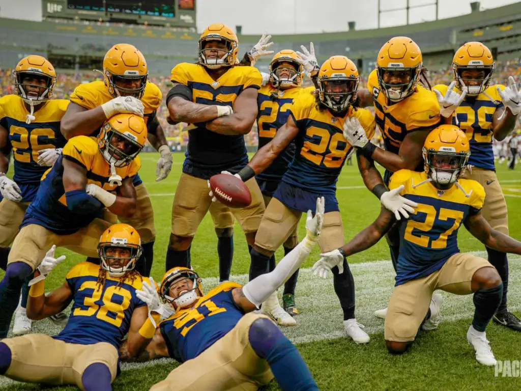
Aaron Rodgers trying to get off the field as quickly as possible to take off these throwback uniforms #nflweek3 #packers #broncos #nfl
— Aaron Wong Kaufman (@WongKaufman) September 22, 2019
Obviously, the more styles and combinations, the more merchandise the NFL can sell. If the fans are willing to buy what they see, you can’t blame the league for offering what’s in demand. Ultimately, the fans decide what they spend their money on and the league responds accordingly to increase the popular or discontinue the rejects.
XFL Colors – More Needed
The XFL has some excellent color variations that we’ll enjoy seeing in the spring, but there seems to be one problem; mostly only two colors per team. The NFL has three colors most teams which is perfect.

XFL Team Colors Review
- LA- The Wildcats Red and Orange need a dark color to complement them. Black would do nicely.
- NY- The Guardians are Gray and Black. The eyes and teeth are red, so we’ll see how prominently it shows in the uniforms.
- St. Louis- The Battlehawks (very slick name) are gray and blue; somewhat drab that needs some red, yellow, green or blue.
- Dallas- Similar to NY, the Renegades have two colors with red eyes on the mascot. Lets see a good balance or mix of all three.
- Tampa- I’m not a fan of green, but at least this one is darker and easier on the eyes. The yellow goes well (like the Packers), but it could use some silver or white included.
- Seattle- I don’t like the mascot (fairy tale names don’t sound good; i.e. “Wizards”) and the bright orange is horrible. The LA orange is manageable, but this Broncos replica should be toned down. The red on the dragon’s breath and “mane” is too similar to the orange. Get some blue or more black and it will be more palatable.
- DC- The Defenders have a nice color arrangement, but desperately need a third color. The nation’s capital should resemble the American flag, so a nice blue would polish it off.
- Houston- Nice logo. This color scheme should have been used for Washington. However, the colors look great and homage to the long lost Oilers it excellent.
Home & Away XFL Uniforms?
We don’t know if the XFL will rotate uniforms, and if they do, if it will be according to whether they play at home or away. To save money, the AAF utilized only one uniform for five of the eight teams (Orlando, Memphis & San Diego had two). The white jerseys on Salt Lake would have worked better if they were alternated with a blue one, but that wasn’t a necessity. For consistency, the other three major pro sports (with significantly more games per season) typically wear white at home and gray or main colors on the road.
For now, each team will have 1 uniform that will be worn for both home and away games.
— The Alliance (@TheAAF) January 10, 2019
Eventually, we’ll forget about colors, names and logos and settle in for the excitement of more pro football after the Super Bowl. Wins and losses are the bottom line in sports, not what the players wear. Still, in the lead up to the uniform announcement, we can use our imaginations and have some friendly debates on what looks best.
Should the XFL have a Color Rush? What’s your angle on what the uniforms should look like, how many colors and variations they should have? The comment section below is waiting to hear what’s on your mind!
Unleash the Action: Sign up for XFL Insider and Fuel Your Passion for Football!

6 Comments
Leave a Reply
Cancel reply
Leave a Reply
This site uses Akismet to reduce spam. Learn how your comment data is processed.
XFL Kickoff
XFL News Alerts
USFL and XFL Merger: A Deep Dive into the Historic Collaboration
Latest Podcast
-


XFL Podcast
/ 12 months agoXFL-USFL Merger Insights: Houston’s Future, Draft News, Player Movement – Ep. 216
Welcome to Episode 216 of the “XFL Week In Review,” your premier destination for...
By Mark Perry




Jerry Lukaszewicz
September 27, 2019 at 12:33 am
I like two toned uniforms in most cases. Adding a third color to the uniforms is a good idea and I like to see creativity on the leg stripes. I’m old school where complimentary color socks were offset by shorter white ones.
Tony Walters
September 27, 2019 at 4:53 am
I like the old school uniforms with the three stripes down the legs and on the arm the numbers on top of the shoulders and a larger numbers on the front and back of the uniform with the matching 3 stripe socks. I also believe they should have a home and away jerseys. Old school football was the best I think this is what the league is going to bring so we should bring back that style of uniform.
AmericanRogue
September 30, 2019 at 1:23 am
I personally like all of the eight XFL team names,colors,and logos and as a proud and lifelong American Pro Football Fan I am excited and looking forward to the relaunch of the XFL and its return season next year in 2020 and I cannot wait for all the great gridiron action to begin as well.
Christopher Bonn
September 30, 2019 at 12:21 pm
I prefer contrasting pants and jerseys. To me monochromatic uniforms look like longjohns.
Adam Kopczyk
October 17, 2019 at 8:10 am
Did you just say Cleveland’s color rush uniforms are “Black on Black”??? They’re the Browns, the uniforms are BROWN! lol
Johnny Lucas
November 27, 2019 at 4:15 pm
Adam Kopczyk,
If you review the article, there is a photo showing the “Black on Black” uniforms worn by the Browns. Both the jersey and pants are black. Only the helmets, stripes and numbers are brown.