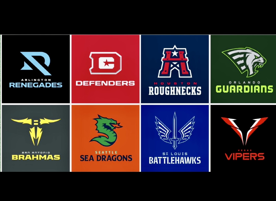
The XFL has finally and officially revealed their team names and logos for their upcoming 2023 season. It’s rather fitting that the league would unveil its new branding on Halloween. For some 2020 XFL loyalists, the new tweaked logos might be more trick than treat; for others, the refreshing of brands may be a welcome change.
After all, when it comes to team branding/logos/colors, it’s an exercise in personal subjectivity. Sometimes, as was the case for me in 2019, it takes time for a name or brand to be viewed in a favorable light. The St.Louis Battlehawks instantly come to mind.
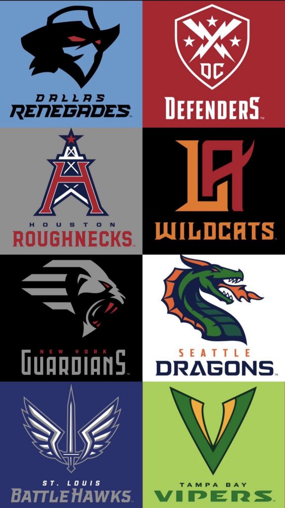
Just for comparison’s sake. Here are the logos from XFL 2020. Because they were the accepted brands that had built up equity. It may take time for the new 2023 logos to be accepted. It’s worth noting that brands like the Roughnecks had to be tweaked because of copyright issues.
XFL 2020 Logos
I typically prefer not to have knee-jerk reactions, and things tend not to age well if you don’t take time to look at something from all angles and let it process. That way of thinking and trepidation has made me a mediocre at best social media follow.
But you are not reading this article to learn about my personal preferences or shortcomings. So, even without seeing helmets, and uniforms, which will be an accurate measure of each team’s brand. I will present my premature rankings and flawed opinions on the team logos and rank them from last to first. Feel free to disagree because I will probably end up second-guessing myself in a few hours.
Sidenote, before we delve in. Secondary logos for the XFL brands were released this morning, independent of the league. Since then, the secondary logos have been pulled from various articles, mainly on ESPN. But I am going rogue, so here they are in their entirety.
Ranking The XFL 2023 Team Names & Logos
#8: Seattle Sea Dragons
The positives: Seattle being back period is a positive for the XFL. Same stadium, the same city, and the same great colors. Same name? Kind of. Personal preference unless it ends up on the cutting room floor. I dig the alternate logo. The trident with the letter S and D hidden inside is cool.
The negatives: Why? There wasn’t a need for any change to this brand. People will still refer to this team as the Seattle Dragons for shorthand. The sea part will get lost at sea.
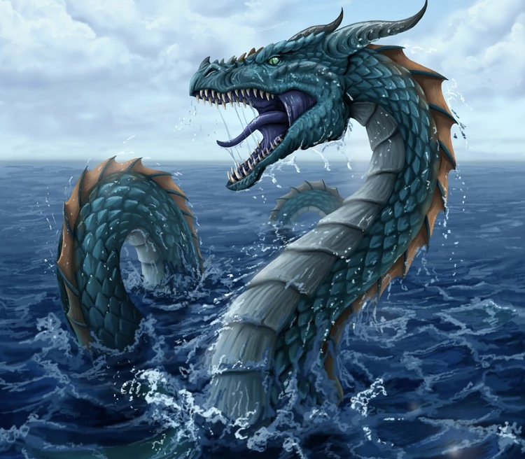
And if you were going to tweak something, why use this particular dragon, which looks like a seaworm or sea horse? The XFL 2023 Seattle “Sea Dragon” needs to work on its training regimen. Nothing about the new Dragon looks intimidating. This was an unnecessary change. A rendering like the Sea Serpent pictured below would have been great.
#7: Las Vegas Vipers
The positives: The alliteration of the Las Vegas Vipers works. The colors are great. A lot of excellent branding possibilities with Red-based Vipers. Although many would characterize this as a leap, Vipers are commonplace in Nevada. The uniforms and helmet design have a chance to be excellent.
The negatives: I would have preferred an original idea for the Las Vegas market. The overall concept seems a bit lazy to me. It’s the same issue I see with Orlando. More on that in a minute. But if you are going to play the recycling game. If any brand from the 2000 XFL iteration would have deserved to return, it’s the Outlaws. Perhaps the tweaks to the Vipers’ overall look will win me over in the end. There’s potential here.
#6: Orlando Guardians
The positives: I like the color scheme. The neon green fits Orlando perfectly. The dark tones can make for a great contrast. I can’t wait to see how this is incorporated into helmets and uniforms. The Guardians’ name has always been a great choice because it encompasses more than just one single entity. The new Guardians logo looks more like a Panther than the old Gargoyles of Gotham. Considering the region, it works.
The negatives: Sometimes, personal bias comes into play. As someone who covered the New York Guardians, I loved everything about that brand. So it will take me some time to accept the Guardians in Orlando. If NY ever returns in XFL 3.0, they won’t be the Guardians. Some tri-state 2020 XFL loyalists may take to calling Orlando the Fugazi Guardians.
A more meaningful gripe, however, is the lack of creativity involved because Orlando is a new city to this version of the XFL. (Not counting Louis Riddick’s Rage in XFL 2001). I was personally hoping that Orlando would forge a new brand in XFL 2023. I understand wanting to keep the Guardians’ name. MLB liked it, too; they confiscated it for Cleveland. But I think a new name/brand would have been more exciting. Surprisingly, the Vipers name wasn’t the recycled choice in Orlando. But even then, I would have been opposed.
#5: San Antonio Brahmas
The positives: One could argue that the Bull/Horn branding is overdone in pro sports. Especially when it comes to Texas-based teams, however, I like the unique twist here on that old trope. It’s original. The logo is pretty cool looking, and I dig the colors. The Brahmas have a chance to have the same BattleHawks absurdity appeal.
The negatives: The secondary logo is not as neat as the primary. But I get what they are going for. Admittedly, I am a huge fan of the Rock and a lifelong wrestling fan. But I still feel strange about an XFL team adopting an aspect of Dwayne Johnson’s wrestling persona. I know it was just a tattoo and nickname for the Brahma Bull. And it’s a significant brand for Johnson with Under Armour. But something doesn’t feel right about a team leaning toward a league owner. I will get over it.
#4: Arlington Renegades
The positives: There was a lot of controversy surrounding this brand’s last go-round. Simply because there have been so many desperado/renegade/outlaw brands in sports that look similar to the XFL version, but keeping the team name is a win for me. The colors are great, and the new primary logo is sleek and clean looking.
The negatives: There’s an argument that less is more. But somehow, this branding looks pretty incomplete. Perhaps the safe bet is a good thing. But I am curious how the new Arlington logo is incorporated on helmets. It’s very plain. Will the unique lettering replace the actual Renegade on helmets?
#3. DC Defenders
The positives: The overall brand, colors, and name returning to Audi Field is a victory for spring football justice. The returning Defenders was a no-brainer for XFL 2023. Although there are some tweaks to the overall look, it’s very subtle. The new secondary shield looks like a pentagon shape. The DC primary logo was the team’s secondary logo in 2020.
The negatives: Although the league is resisting making the secondary logo official. They would be foolish not to incorporate it heavily. Of all the team brands returning from 2020, the Defenders didn’t need any tweaks to their primary logo. The shield, with crossing lightning bolts and stars, was dope. It fits the region, and, let’s face it, carrying a shield is always excellent gimmickry for fans. I am not sure the DC with the star needed to be primary. But that’s a minor nitpick overall.
#2: Houston Roughnecks
The positives: It seems ridiculous to get nostalgic over a team that existed only two years ago. Perhaps that feeling has been heightened by watching former Houston Roughneck QB P.J. Walker throw 70-yard lasers for touchdowns in the NFL. But boy, am I happy that the Roughnecks are back. And that the changes to the logo are incredibly subtle. I always liked the tip of the hard hat to the Oilers in 2020.
Honestly because of issues with NFL properties and Tennessee Titans/Houston Oilers ownership. I thought, for sure, that the Roughnecks’ primary logo would be abolished forever. Not only has the H-shaped oil rig remained with a slight tweak, but the secondary logo, which had to be changed because the New England Patriots thought that the hard hat logo was too close to Flying Elvis (beats me), is an excellent addition.
The negatives: I have to dig deep to find one. I am a little unsure how the league will handle the silver color in this scheme. Silver/Grey was a big part of the overall look in 2020. There is some uncertainty there in terms of whether the main focus will be just red and blue this time.
#1: St. Louis Battlehawks
The positives: Maybe you shouldn’t get bonus points for doing the obvious. But XFL 3.0 would have been dead in the water if they didn’t bring back the Battlehawks. The name, the sword, and the wings had to return. It’s the league’s best and most beloved brand. There was never a doubt, although, for some crazy reason, there was plenty of hysteria from the STL crowd about a new name gracing the team. The Scooters? Some even dramatically assumed and speculated that the new XFL would abandon St. Louis altogether. The H in Battlehawks may no longer be capitalized, but this is the capital franchise and city of XFL 2023.
The negatives: The secondary logo leaves a lot to be desired. Perhaps that can end up on the cutting room floor. I may not be very perceptive, but I don’t see how the lettering style captures the market or the brand. Is there an Arch I am not seeing? I am hoping that the XFL sticks with the same helmet design from 2020.
Final Thoughts On The XFL 2023 Names/Logos
We knew the names for a while because the league leaked them on their website, and it wasn’t a groundbreaking scoop or news report. And for several months, the cities were reported by myself. We all knew that 2020 brands would return and there would be new cities since the end of 2021.
Anytime you introduce logos, names, or brands. They are bound to be criticized, especially at first blush. It’s incredibly challenging to handle established brands from the same league, and it’s almost a no-win situation. Time can be your friend and enemy in this situation. As time passes, I think there will be more of a comfort level established with XFL 2023.
Overall, I think the XFL 2023 names and logos are acceptable. I have a much more keen interest in the team uniforms. Because without them, a team’s overall look and feel is incomplete. Style is important. But at the end of the day, the type of football league, the new XFL produces will provide the most relevant substance.
Unleash the Action: Sign up for XFL Insider and Fuel Your Passion for Football!
I am a pro football writer who has extensively covered and reported on multiple leagues over the years. I started covering the XFL back in 2001. You can follow me on Twitter @byMikeMitchell

2 Comments
Leave a Reply
Cancel reply
Leave a Reply
This site uses Akismet to reduce spam. Learn how your comment data is processed.
XFL Kickoff
XFL News Alerts
USFL and XFL Merger: A Deep Dive into the Historic Collaboration
Latest Podcast
-

XFL Podcast
/ 12 months agoXFL-USFL Merger Insights: Houston’s Future, Draft News, Player Movement – Ep. 216
Welcome to Episode 216 of the “XFL Week In Review,” your premier destination for...
By Mark Perry




Arch
October 31, 2022 at 5:03 pm
Pretty spot on with these assessments, Mike.
I do feel like the Brahmas is an ego trip for DJ, which I’m not super keen on, but I think that after saving the XFL it’s a bit of a Legacy think for him, so I won’t complain too much.
Is Arlington keeping the original Renegades logo as its secondary?
The Brahmas secondary logo is absolutely absymal.
Guardians color scheme is dope, but the Panther theme doesn’t fit the “Guardians.” Orlando Lion-cats or something would have been better, something feline at least. Secondary logo is generic as well, IMO.
I am really digging Vegas Vipers with the blood red color scheme.
Roughnecks actually improved a little bit, and secondary logo works great too.
Battlehawks is still great. Alt needs to be thrown out the window ASAP.
I get what they are trying to do with the “Sea” branding for Sea Dragons, considering the Seahawks and the Major League Rugby team the Seawolves, so I don’t hate it. Original dragon was MUCH fiercer though. Alternate logo is fantastic.
There’s my rundown. Agree with you that I can’t wait to see how these look on uniforms. Excellent Article Mike
Mike Mitchell
October 31, 2022 at 7:31 pm
Thank you Arch for your comments and for checking out the article. In subjective things like this. There’s no real right or wrong. I have a feeling that I am going to like the Vipers more as time progresses.
Not sure yet on the secondary Renegades logo. It’s worth noting that the league had them pulled today from the ESPN article. The alternate STL and SA logos need to be scrapped.