The original XFL is very much similar to the new XFL in the sense that both leagues are designed to have the same number of teams which is eight. The original XFL consisted of the following teams: Birmingham Thunderbolts, Chicago Enforcers, Las Vegas Outlaws, Memphis Maniax, New York/ New Jersey Hitmen, Orlando Rage, San Francisco Demons and the Championship Team, Los Angeles Xtreme.
Each of the teams had a unique logo that really defined who they are, that really told them apart from the other teams and that really stood out in a way that you could right away distinguish and point out the team that the logo represented. The Birmingham Thunderbolts had a primary logo design that had a letter “B” at it’s center and it was surrounded by bolts of thunder. While other teams can boast about their professionalism and their championships, the Birmingham Thunderbolts are known for their love for football more than any other team. The Royal Purple, Silver and Fluorescent Yellow team colors that surrounds their logo really captures the Bolts electrifying spirit. The Birmingham Thunderbolts had other logo designs that had the word “Bolts” at it’s center that was surrounded by bolts of thunder as well as just a simple letter “B” with the logo’s colors that was without the bolts of thunder and the word “Birmingham Bolts” at it’s center that was surrounded by bolts of thunder.
The Chicago Enforcers had a primary logo design that had a somewhat misshaped letter “C” as it’s centerpiece then a fist sticking out of that misshaped letter “C”. Only a few cities are said to be able to match Chicago’s long history of strength, toughness, and attitude when it comes to professional sports. The fist of the Enforcers logo is the perfect icon for this dominant city. The Purple, Black and Silver colors that surrounds their logo real captures the Enforcers’ toughness and strength. The Chicago Enforcers had other logo designs that had the misshaped letter “C” at the bottom still with a fist sticking out of it and the word “Chicago Enforcers” at it’s top and both the word and the letter is inside a shield like symbol. There was another logo design with just the word “Enforcers” as well as just the word “Chicago Enforcers.”
The Las Vegas Outlaws had a primary logo design with the letters “L” and “V” intertwined with each other. This city’s rough and tough history was said to have embodied in the Outlaws’ style of play. The Black, Vegas gold, and Burgundy colors were the only colors said to be good enough to drape these Outlaws. The Las Vegas Outlaws had other logo designs that had the words “Outlaws” and “Las Vegas Outlaws” as the center piece of the logo as well as the letters “L” and “W” intertwined with each other inside a bull type figure.
The Memphis Maniax had a primary logo design with the letters “A” and “X” connected to each other which spells AX as they were said to have always AXED their opponents. The Maniax are said to be one of the most intimidating and devastating teams in the entire XFL and their team colors which are Teal, Burgundy, Black and Yellow are said to have defined that. The Memphis Maniax had other logo designs that had the words “Maniax” and “Memphis Maniax” as the centerpiece of the logo as well as a face of a character that had eyes that could be used as a hallucination tactic.
The New York/ New Jersey Hitmen had a primary logo design with a letter “H” as the centerpiece and that letter “H” had spikes at each corner. Aggressive, Relentless, In-Your-Face, and Hard-Hitting was said to be the best way to describe the style of play of The New York/ New Jersey Hitmen. The Hitmen’s team colors are black and blue, just like how they will leave the faces of their opponents after they have competed with them. The New York/ New Jersey Hitmen had other logo designs that had the words “Hitmen” and “New York – New Jersey Hitmen” as the centerpiece of the logo as well as the letter “H” as the centerpiece and that letter “H” had spikes at each corner then the word “Hit” on top of the letter “H” and the word “Men” on the bottom of the letter “H” and a mean looking face with the letter “H” as the ears.
The Orlando Rage had a primary logo design with a face that was full of rage as the centerpiece and a bolt of lightning beneath the face. The logo and colors embody the emotion of Rage, a name by which any football coach would hope his team would be characterized. The team’s colors were Red, Navy Blue and Yellow. The Orlando Rage had other logo designs that had the word “Rage” as the centerpiece and a number of lightning bolts surrounding the word “Rage” as well as just the letter “R” as the centerpiece and a number of lightning bolts surrounding the letter “R.”
The San Francisco Demons had a primary logo design with a face of a demon as the centerpiece and the word “DEMONS” on the head of the face. There could be no symbol or team name that was more menacing than the “DEMONS”. The name alone could strike fear to the opponents even before they compete against them. The team’s color were Red, Black, Yellow and Gold. The San Francisco Demons had other logo designs that had the word “DEMONS” and “San Jose Demons” as the centerpiece and the letters “D” and “S” with horns on them and the letter “M” with like a pitch fork on top of it. They also had a logo design with a pitch fork like symbol and a flame like symbol as the centerpiece.
Finally, The Champions Los Angeles Xtreme had a primary logo design with a blade like symbol as the centerpiece then a misshaped letter “X” in the center of that blade and the letters “L” and “R” at it’s sides. Known for its cultural, geographic and economic extremes, Los Angeles is the only city distinguished enough to hold the “Xtreme” name. The team’s colors were Navy Blue, Gold and Silver. The Los Angeles Xtreme had other logo designs that had the word “XTREME” and “Los Angeles Xtreme” as the centerpiece and the letter “X” in the word “XTREME” was shaped like a blade. The other logo design was the letters “X” and “R” on the sides and a misshaped letter “X” shaped like a blade as well as the word “Los Angeles Xtreme” as the centerpiece and there was a blade like figure on top of the word then the letters “L” and “R” on the sides of the blade like figure.
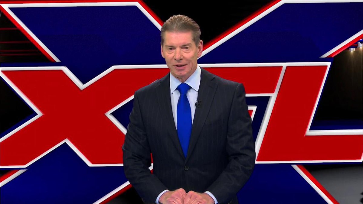
Vince McMahon has mentioned that all of the teams that will be part of the new XFL will surely be unique and standout from the teams of the original XFL and those teams will have logos that will distinguish them from the other teams and that will define them for what they truly are. The first team was already mentioned and it will be interesting to see what logo will this team come up with as well as the other teams that will be announced as we get close to the relaunching of the XFL in 2020.
Unleash the Action: Sign up for XFL Insider and Fuel Your Passion for Football!

USFL and XFL Merger: A Deep Dive into the Historic Collaboration
Latest Podcast
-


XFL Podcast
/ 2 years agoXFL-USFL Merger Insights: Houston’s Future, Draft News, Player Movement – Ep. 216
Welcome to Episode 216 of the “XFL Week In Review,” your premier destination for...
By Mark Perry


