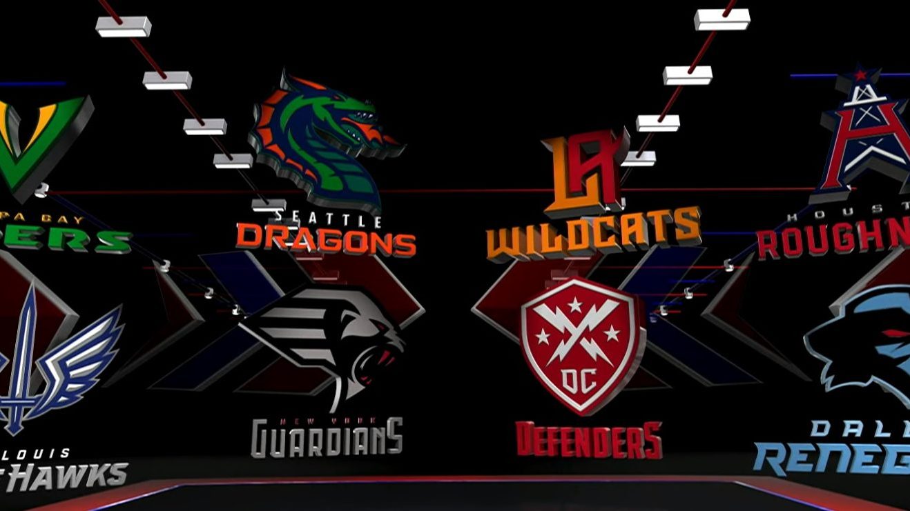
If you’re anything like me then you were pumped for today’s XFL Team Names & Logos announcement! I was to the point where I locked the door to my office, unplugged my phone and kicked it over to YouTube on my TV and blocked out the rest of the world! Almost, but not really (gotta say that in case my boss finds this article).
Finally, the frustration is over and we now know both the names and logos of all eight XFL franchises. As the Commissioner Oliver Luck stated, “We know you’ve been waiting to see the names and logos of our eight XFL teams, and today, you’ll get to see them all!” My heart leaped at the knowledge that we were finally here, the time has come. The first announcement was, of course, St Louis, and then continuing down the line. After it was over I was a bit more revved up for the season to hurry up and get here. I have to say, I was honestly a bit surprised! The names and logos (most all of them) were pretty good and the logos were pretty slick.
So I got to thinking, I need to rank these ASAP! As I’ve done in my past articles “Ranking the 2001 XFL Team Names” and “Ranking The Eight XFL Head Coaches” it would be fun to do this with the new team names and logos so here we go! Like always, these rankings are not based on anything but my thoughts and opinions.
#8 Tampa Bay – Vipers
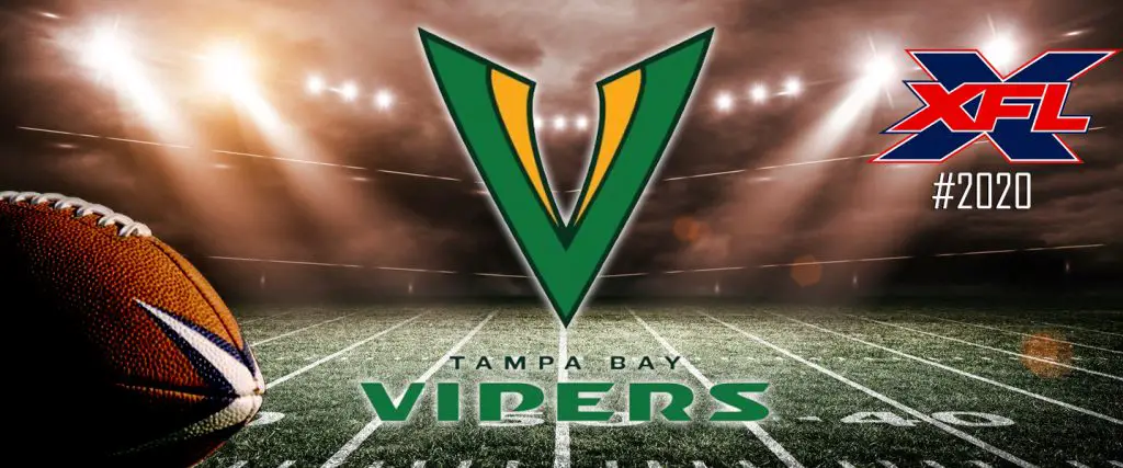
This was my least liked logo and name, the logo was pretty plain and to be honest, I was expecting all of them to have more of a logotype of a logo and not lettering! I think they could’ve done something really cool with a name like the Vipers and with that green and yellow/gold scheme it would have been really killer but in my opinion, they fell short with this logo!
#7 Los Angeles – Wildcats
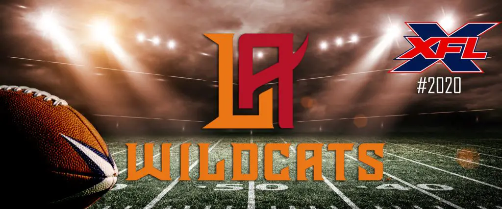
Like the Vipers, they could’ve done something really cool with a name like the Wildcats. I did however like the way they did the LA with how they brought up the A and somewhat connection with the L! I’m really hoping the uniforms will be styled nice and make up for the lack of a logo.
#6 Seattle – Dragons
I’m sorry, I’m sorry! Out of those five potential names for Seattle I was hoping they would not have used the Dragons. But to be fair I wasn’t much of a fan of any of those other names. I myself would’ve chosen the Force (perhaps it’s the Jedi in me lol) as that sounds like they could’ve done something really neat with that. Alas, they chose the Dragons! I suppose they didn’t read too many of the chat boards as I scanned a bunch of them and most fans didn’t like the name Dragons either but hey, it is what it is! The logos not terrible but to me, it looks too gimmicky. Honestly, if they didn’t have a logo it would’ve been dead last on this list!
#5 Houston – Roughnecks
Can anybody remember an old Houston football team? Oh, what was their name? Oh yeah, the Oilers! Does that logo look anything similar to that? The first thing I thought at the end of the video promo is that was the best logo the team could come up with? I don’t know, it just reminds me too much of the Oilers and even the team colors are going to remind me of that. I guess the newer generation won’t know anything about that but to us…older and wiser…will think the same thing! I did, however, love their promo video though.
#4 Washington DC – Defenders
I absolutely love the name Defenders! Probably the most “Badass” name on this list. The logo, however, reminds me of an MLS logo, it’s not bad I just think of a soccer team when I look at it! After hearing the name Defenders, I’m glad they didn’t go with the Valor as some had suggested (but since there’s an AFL team by the name of Washington Valor, that couldn’t work!) so the Defenders sounds cool. Plus they had one of the best promo videos.
#3 Dallas – Renegades
Even though the name sounds more like it would’ve fit into the old XFL team the logo looks pretty cool (though there is already a skepticism with the name and logo, be on the lookout for that article coming up) as it looks pretty badass and looks like their poised to rob the league and wreak havoc on the teams they’ll face! Color scheme is slick also and the names font looks cool too!
#2 St Louis – Battle Hawks
I would say this team name is probably the most original name I’ve heard for a team (well, as of lately). The logo is superb and I love the wings with the sword, almost looks angelic! The colors go good together with that type of logo and really meshes. I loved how they showed the Air Force and eagles and hawks in the promo video, really seemed to fit the team name and logo. Excelent job on this one team XFL!
#1 New York – Guardians
As soon as that video for New York started I was lovin’ the vibe! Those gargoyles looked awesome…and terrible! Then, the logo comes up and I’m like damn! That kicks major ass! I love that goth vibe they added to the logo and font they used and just that little bit of red looks so sweet, by far the best one of the bunch! I really hope they come through on the uniforms and don’t go overboard and ruin it like some teams have done in the past!
Well, that’s my take on the 2020 XFL team names and logos. How would you rank them? You think I ranked them right? If not, let us know how you would’ve ranked them in the comments! Thanks for reading and let go XFL!!!
Unleash the Action: Sign up for XFL Insider and Fuel Your Passion for Football!

USFL and XFL Merger: A Deep Dive into the Historic Collaboration
Latest Podcast
-


XFL Podcast
/ 1 year agoXFL-USFL Merger Insights: Houston’s Future, Draft News, Player Movement – Ep. 216
Welcome to Episode 216 of the “XFL Week In Review,” your premier destination for...
By Mark Perry


