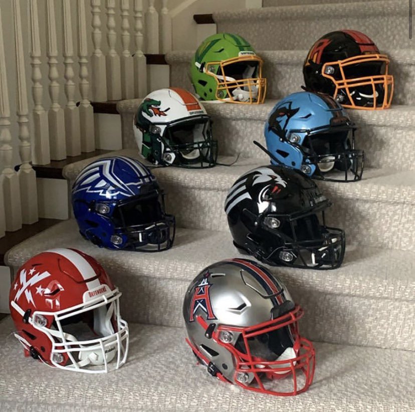
As the XFL gears up to build its future, owner Dany Garcia tweeted out this picture of all 8 XFL Teams’ helmets. With speculation swirling about the relocation of the Wildcats and Vipers, it shed some light on new ownership’s position on the teams.
There is a weight when you choose the big and the important and that weight is appropriate. Great things require the acceptance of great responsibility. @xfl2020 #ForTheLoveofFootball#ForTheLoveofTheAthlete#ForTheLoveOfTheFans pic.twitter.com/lwdDh4D5CC
— Dany Garcia (@DanyGarciaCo) August 14, 2020
It seems we’re going to see a lot of continuity here, and this is great news. The XFL’s iconic look was building momentum, and what’s more iconic in football than the helmets? Just for fun, let’s take a look at the spread.
1. New York Guardians
Man, I just love the Guardians’ look. Always been a fan of all-black uniforms, and the helmet just completes the aesthetic. Clean, dynamic, modern. It’s a perfect design for the XFL.
2. Houston Roughnecks
The Roughnecks helm is an instant classic. The matte silver stands out from the rest, and the logo is a great mix of retro and modern. A callback to the Oilers logo, I think it’ll quickly become a staple of the culture in Houston.
3. BattleHawks
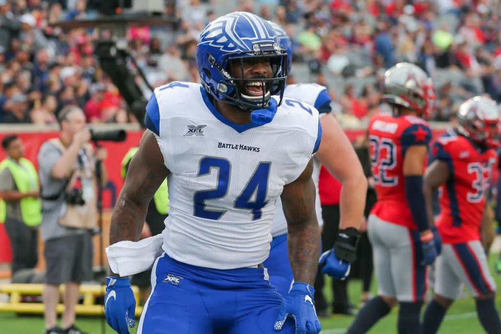
I love a good ol’ winged helmet design. St. Louis’ dome is likened with each half of their logo per side, and it just works. BattleHawks fans are among the most fervent so far in the young XFL, and its easy to see why.
4. Renegades

The Cyan on black is crisp. It’s different, and there’s just something about it. The red eyes on the logo just look awesome, and hopefully this is a new mainstay of a long and successful football tradition in Dallas.
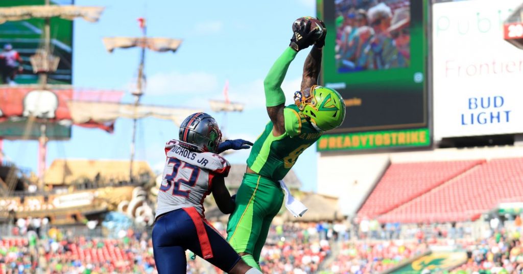
5. Dragons

It’s unconventional, and I’m here for it. Seattle’s Dragon breathes fire on its opponents, and looks good doing it. The Dragons aesthetic is unlike anything we’ve seen before in pro football, and just like the XFL, its fresh and funky at the same time.
6. Vipers
While the Vipers’ future home is a bit up in the air, lets not forget all the great moments they had. After a rough start, their team was really shaping up to be something special, and their dual-tone green helmets made them look good doing it. I like the simplistic logo, but I think they missed an opportunity to make a really cool snake’s head logo here.
7. Wildcats
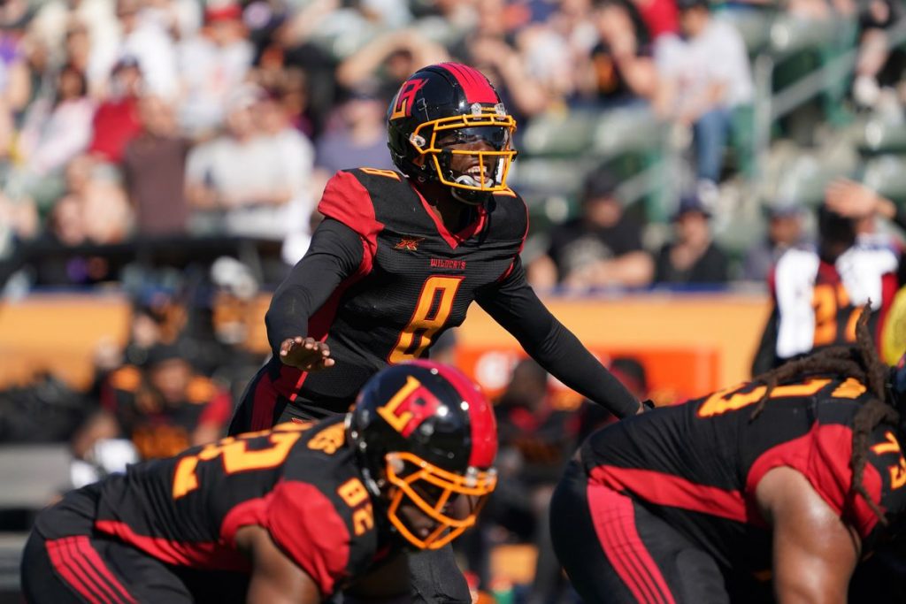
The orange on black is dark and fiery, and even if the LA logo becomes a thing of the past, I’m sure they’ll find a way to make this look good. The color scheme is cool, but LA is struggling to support football teams right now, and I wouldn’t be too surprised if we saw them playing in San next year. Diego? Antonio? Francisco? We’ll see which.
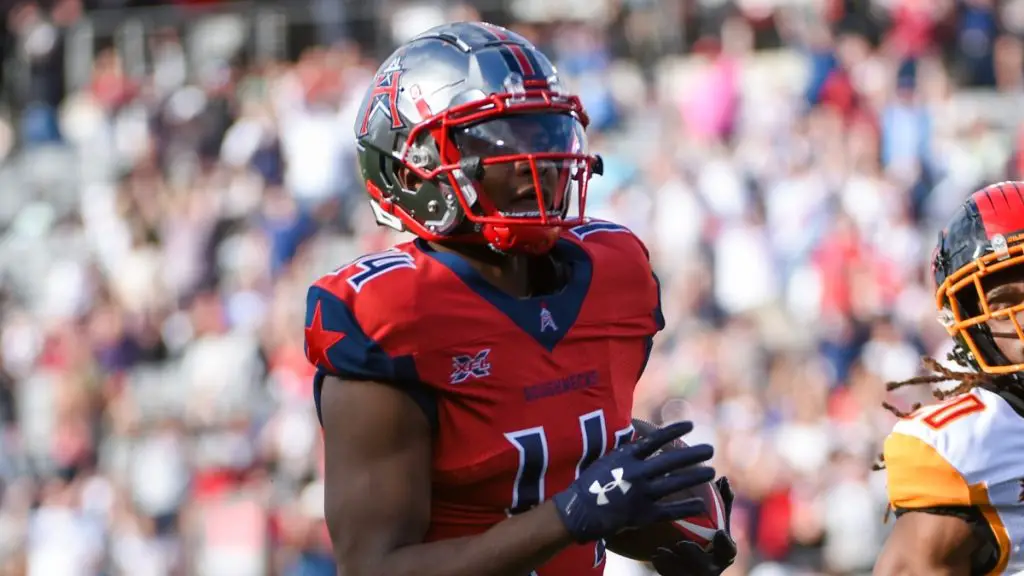
8. Defenders
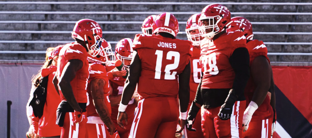
I think the Defenders all-red aesthetic could work, and while the bolts look great on the uniforms, the helmets are a little underwhelming. Their logo is cool though, and I think adding the full shield to the sides could help beef up their look.
Unleash the Action: Sign up for XFL Insider and Fuel Your Passion for Football!