With the big XFL Team Name and Logos revealed two weeks ago. Fans were finally excited to have a team name, colors, and look they could latch on too.
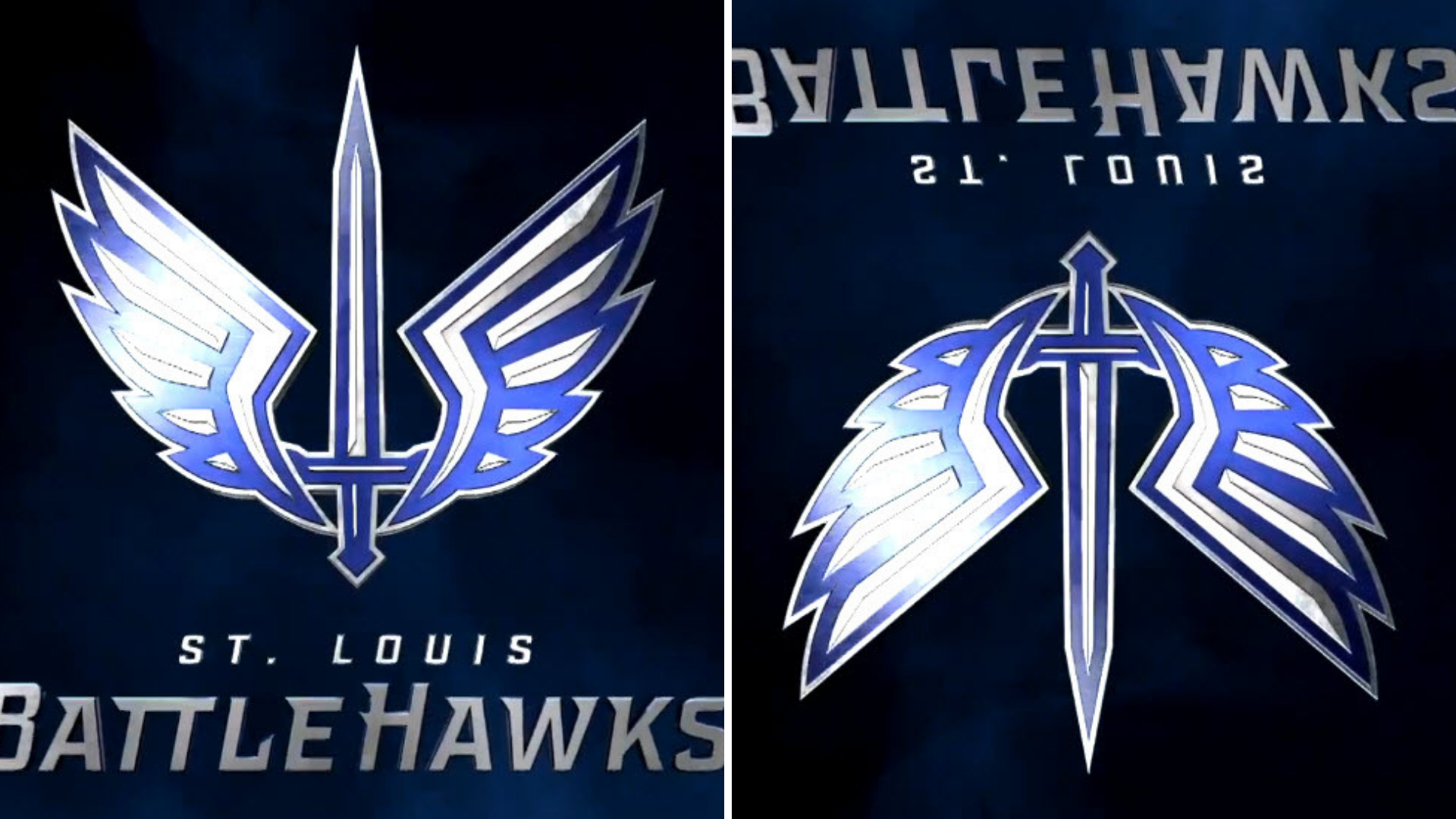
Fans and reporters, like us at XFL News Hub began to rank the logos and dissect everything about them. One logo that got fans attention was the St. Louis BattleHawks logo. Fans had it high on their list because of its unique look and name.
However, it didn’t take long for fans to find the hidden easter egg in the logo that genuinely made it unique to the XFL. If you flip the logo upside down, it reveals the letters STL.
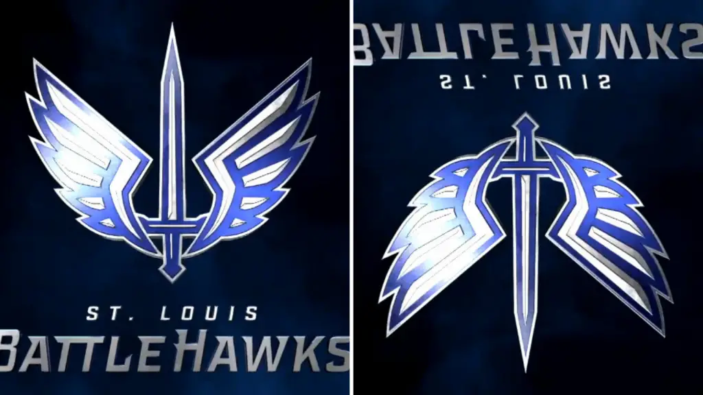
Within hours of the reveal, fans figured out the easter egg, even to the surprise of XFL officials.
Kurt Hunzeker, the BattleHawks team president, said recently in a radio interview that they were surprised how quickly fans figured it out.
Now that team names and logos are part of the discussion of the XFL. Fans are excited about its kickoff in February of 2020.
Unleash the Action: Sign up for XFL Insider and Fuel Your Passion for Football!