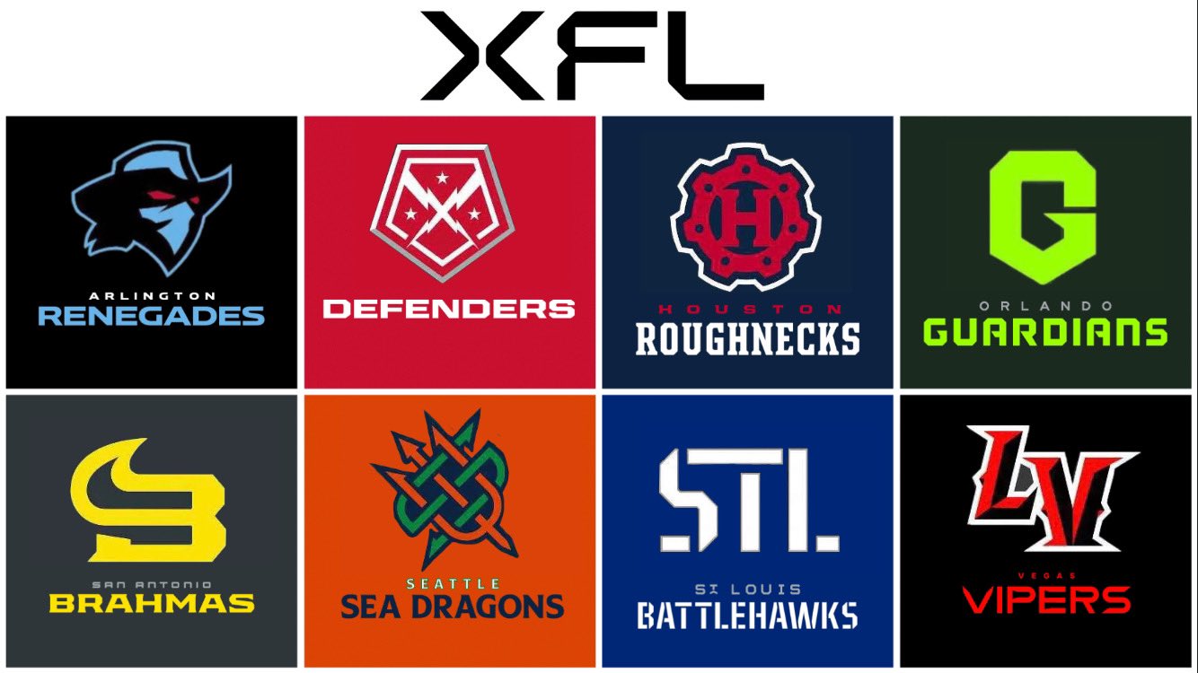
Thursday was the cut-down day for the XFL. Each team was mandated to drop to 51 players total on the roster. Every team complied and games are set to kick off for the 2023 season. Now, the XFL has released some new look logos for each team. Here they are below:
Some interesting concepts are to be seen here. Each logo seems to emphasize something to do with the actual lettering of each team’s city or team name. Except for the Arlington Renegades and D.C. Defenders. The Renegades changed up their color scheme a tad, meanwhile, the Defenders went with a simple shield look. In this piece, we’ll be ranking which ones we like the best, and which ones need some work.
#8: D.C. Defenders
This new logo for the District of Columbia doesn’t do much for anybody. It’s a slight update and more simplistic than their original look. It’s not bad by any means, but it simply doesn’t match with any of the other logos, nor is it all that different.
#7: Arlington Renegades
This alternative art works for Arlington, but much like D.C. it doesn’t do anything all that different. The colors are changed and it does look nice. But isn’t the point of an alternate to be something new and different in comparison to the original? If they just changed their main logo to this I would be in support. But as a simple alternative it just paves the way to some cooler, dark uniforms. But the art itself doesn’t do much.
#6: Orlando Guardians
This might just be personal aesthetic for me, but that shade of green isn’t pleasant to my eye, and the bigger letter G certainly is anything but complex. It works with their original sets, and gives a different take on their original. That’s about all I can say here.
#5: Houston Roughnecks
I feel like they tried to do too much with this Houston logo. It works, the H in the middle of the circle. It screams Texas. But there’s a lot going on with the white outline around it, and the smaller blue circles inside. It’s just not visually appealing at first. I’d be interested to see how it looked on a helmet and the uniforms.
#4: San Antonio Brahamas
I actually really like what they did here. The yellow isn’t overbearing with the dark contadicting background. The bull on top of the B works very nicely. There’s a lot to love with the Brahamas. I wouldn’t be surprised if this might be other people’s number one favorite on this list.
#3: St. Louis Battlehawks
I love this set. You can argue that there’s nothing complex about it, which I agree. But with how their oriignal font works this is a perfect fit. It’s also a very visually pleasing shade of blue that goes well with the white. Well done by the Battlehawks graphics team on this one.
#2: Las Vegas Vipers
Like their hockey contemporaries in the city of sin, this set is sharp. Black and red is always a fantastic combination together, and they knocked it out of the park. For a location based set that focuses on the word Las Vegas instead of their mascot, there’s no better way to blend the two together with a menacing red-black combination that’s dark but sharp.
#1: Seattle Sea Dragons
This art has a lot going on, but it absolutely works. You can slearly see both an attempt for emphasis on Seattle, but still paying hoamge to their mythical mascot. They’re very clever with the D making it a pitchfork of sorts and the orange and the aqua green are also visually pleasing. I think they did what Houston attempted to do, but were just better with it.