With the USFL 2022 season coming up next year, I thought this would be a nice time to talk team logos. I took a look at all 8 teams and ranked them based on color, image, nostalgia, and so on. A few honorable mentions for teams that existed in the first rendition of the USFL: Chicago Blitz, Jacksonville Bulls, and the Oakland Invaders.
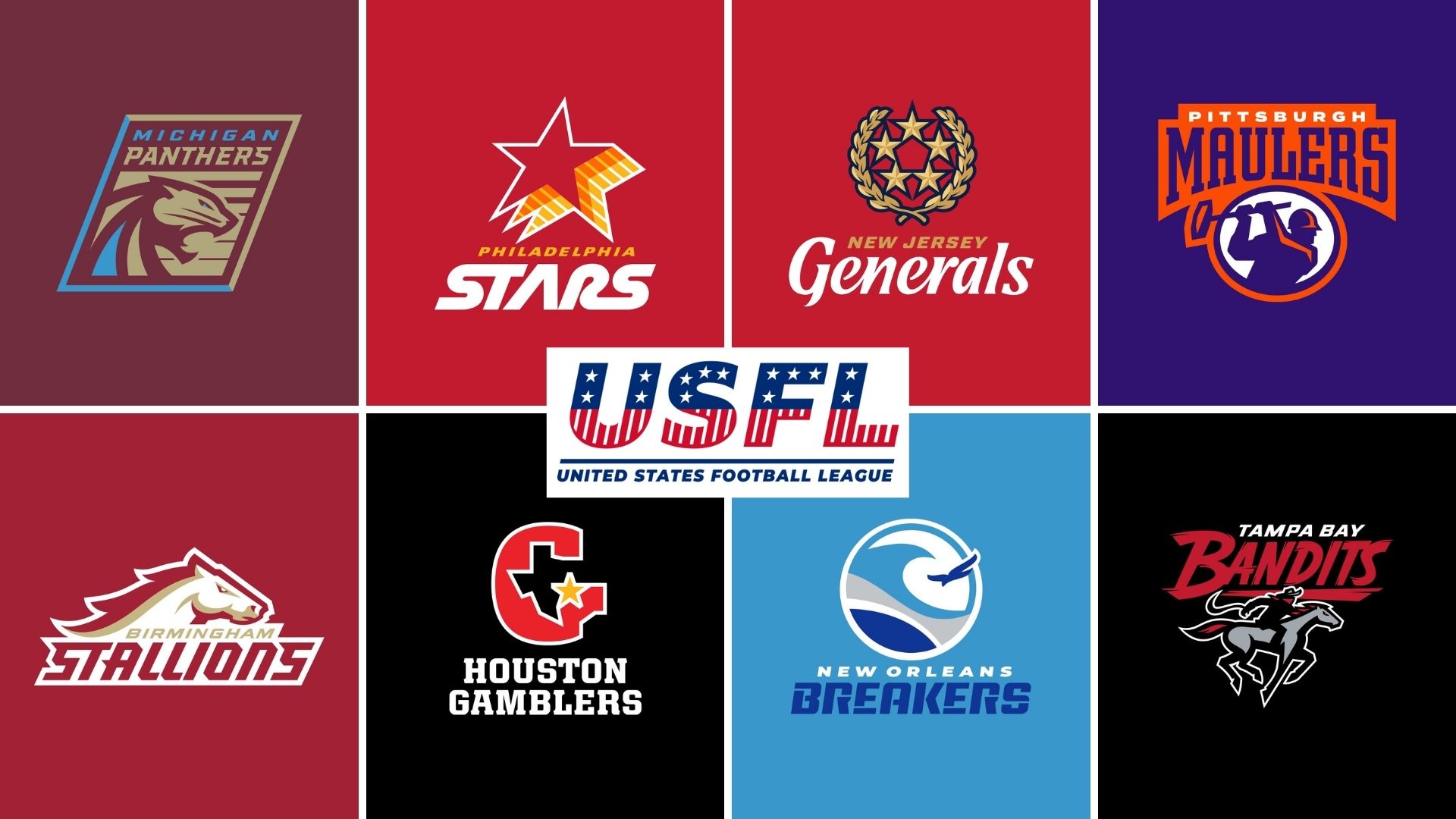
#8 New Jersey Generals
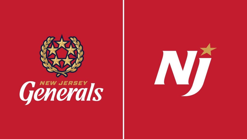
The Generals have definitely upgraded from their original 1980’s look by highlighting the stars with a nice shade of blue. That being said this is by far one of the more boring logos presented to us in 2022. All of the USFL teams, IN HISTORY, feature a shade of red, blue, or gray.
The generals are the worst offender because the alternative image is bland and there really is much room for creativity with the primary. It’d be cool to see more army generals approach, ditch the red and make it dark green. This could really highlight a lot of generals who served in our military forces by having a representation of the uniform they’d wear color scheme-wise.
I hope at least they put the primary logo on the helmets, not the secondary. The 5 stars are incredibly nostalgic, but the colors and the handcuff OF the nostalgic image leave a boring and bland logo for a 21st-century team.
#7 Birmingham Stallions
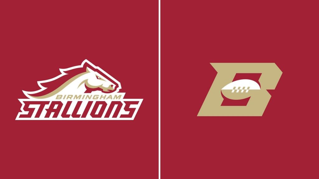
Maybe it’s just me, but horses in football leagues get old. Stallions, Broncos, Colts, Mustangs, etc. The alternative logo is, weirdly, better than the primary. The simple B with a football in the middle is cool for a secondary logo. The graphic of the horse is well done, but it looks almost like Boston College.
Nothing really WOWing or eye-popping when it comes to this one. It’s above New Jersey, cause the alt is better and there’s more creative freedom when it comes to horses. But man, horses, birds, and felines are used WAAAAY too much.
#6 Michigan Panthers
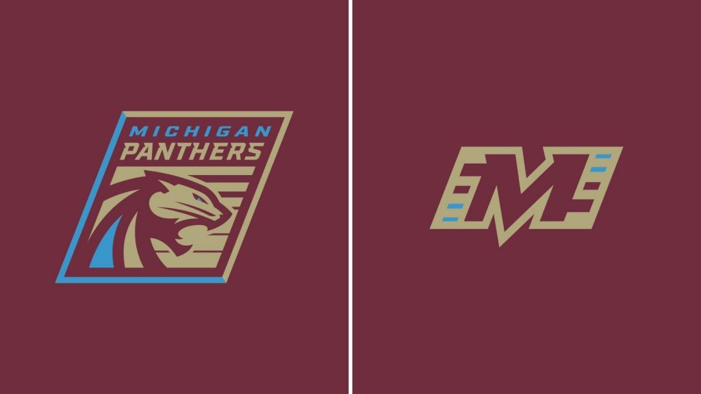
Fun fact, “Panthers” is the #4 most used sports team name across America with 1,124 teams. So it’s also going to get the Stallions treatment of, it gets old. This logo also had the weirdest glow up from its 1980’s original look. If you look at them side by side it’s like the title logo of a NES game vs a PS3 game. Yes, PS3, because even still this logo feels up to date but outdated at the same time.
Its uniqueness comes from the almost playing card-like box it has around the central image. Its alt logo isn’t terrible, nor is it bad. I think they should have gone with a different shade of…I wanna say tan. The panther itself is pretty cool looking, with the nice blue stripe in the center, and the lines in its background make it seem more video-gamey as well. It loses points on nostalgia due to it not being the most well-known USFL team, but it was a better upgrade than the Generals and more unique than the Stallions.
#5 Houston Gamblers
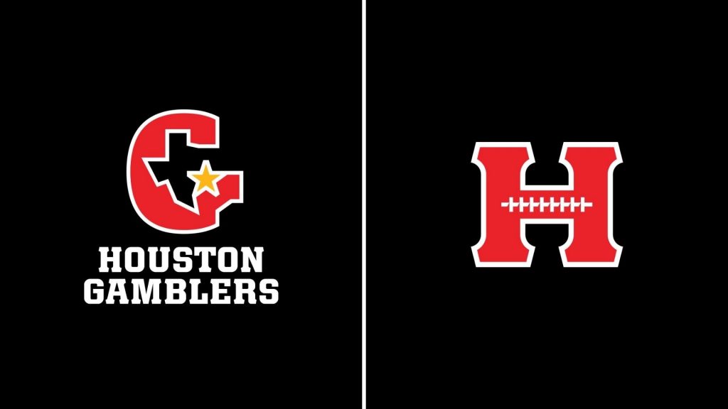
I almost wanted to put this and the Tampa Bay Bandits at 5 due to both teams having almost the exact same color scheme. Jim Kelly is why this is #5, seeing that Gamblers logo makes me think back to when he was the star QB.
The primary logo is legendary nostalgically, but the alt logo is just terrible. It’s a nice H, I guess? They really tried to do something with the football laces and it just feels awkward to look at. Red and Black are always a good go-to, with two teams having similar color schemes, well there is gonna be some tension for sure. Nostalgia alone brought it to 5, the color scheme only weighed due to it being shared, and the alt logo kept it from climbing higher.
#4 Tampa Bay Bandits
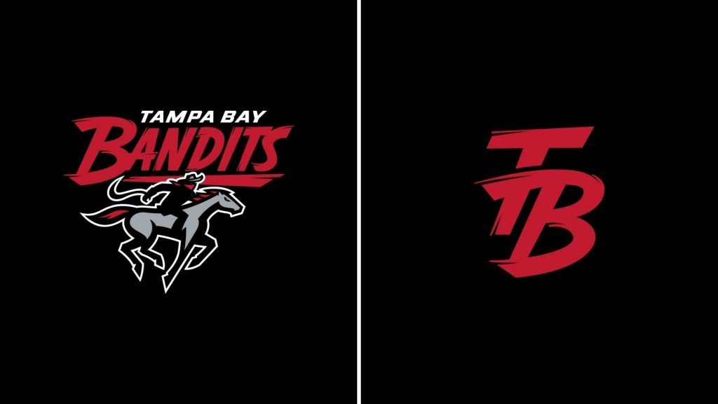
So what do the Tampa Bay Bandits do that the Gamblers don’t? The old Bandits logo, the horseback riding image was all black and the word “Bandits” were very cheesy old western font. Giving the horse some more color and highlighting the bandit gives this more of an identity. They look intimidating, these logos (yes both) are tough looking out of the gate.
Yet, even with the detail and minor red difference, this still gets held back for matching schemes. It’s such a bummer, but having two teams that almost look and sound identical hurts the image. The Houston Gamblers and The Tampa Bay Bandits SHOULD have an epic rivalry of “who rocks the red and black better”. That will all come down to game time, and my money is on the Bandits.
#3 Pittsburgh Maulers
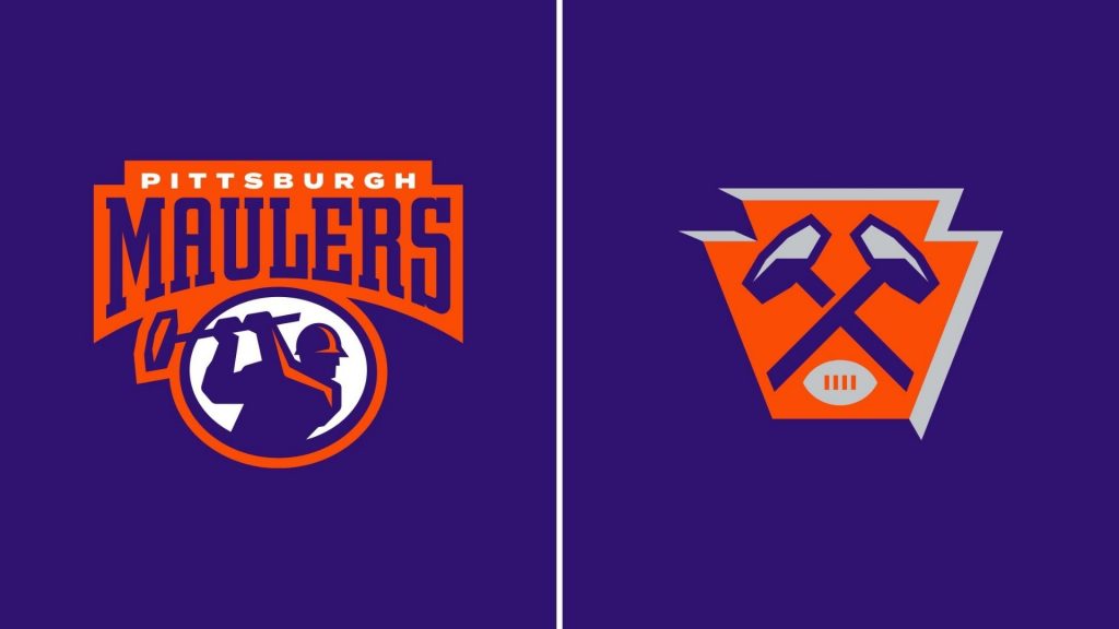
THE PURPLE AND ORANGE IS SUCH A UNIQUE AND COOL COLOR SCHEME. Ahem, I apologize. Yes, this logo wins for being a very unique pairing of colors, to this league anyway. The main logo of the person hammering will resonate very well with Steelers fans.
The alt logo is a very cool, non-letter, based image. Even with softer colors like purple and orange, the name immediately makes me think tough team. I hope they take on the identity of a blue-color tough team to beat. Their logos scream that to me, so it’s now on the team to bring that to life.
#2 New Orleans Breakers
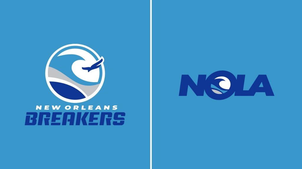
I may catch a lot of flack for this take, but I stand by it. I love soft color schemes, so this one is probably the most biased. I showed this to a friend and they immediately screamed “Sea World”. This is fair, but it’s so easy on the eyes and the uniform ideas are going to mesh so well with this color scheme (if done correctly).
The alt logo is better than another letter-based one because it’s not “NO” or “LA” it’s NOLA so it feels like an identity. Like fans from New Orleans can proudly wear the alt logo in pride of their city and team. From a more critical standpoint, it is still soft colors.
The name, logo, and color scheme are not intimidating. It’s got similar colors to the Detroit Lions, but the dark and light blue are more of the focus than the silver and blue. The text on “Breakers” is also unique enough to be eye-catching, but not for the “wow that’s cool” type reasons. I’d call this font, angsty 6th grader. I still love this despite all those things though.
#1 Philidelphia Stars
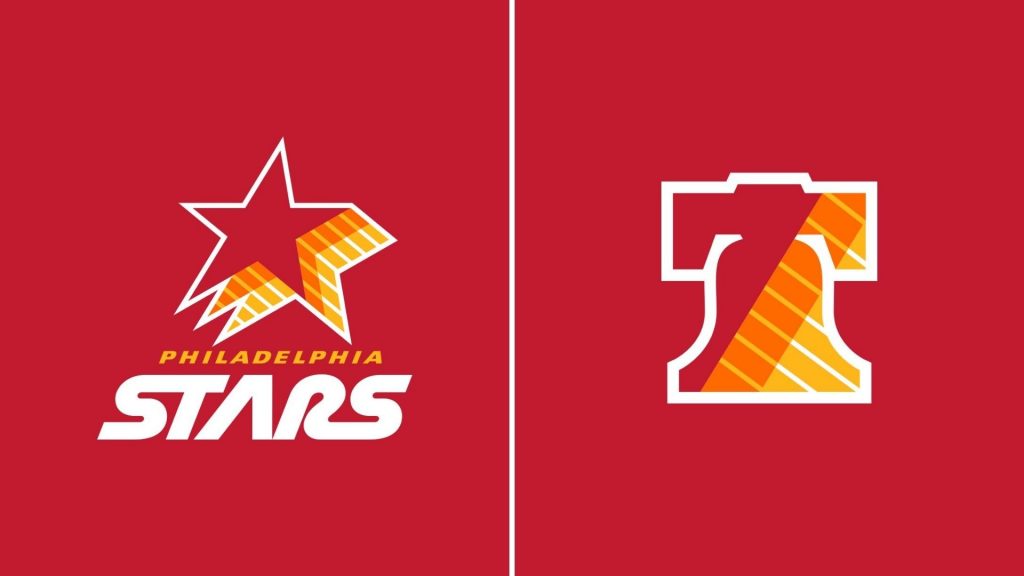
I loved the old Stars logo, where the text and the star lined up. The Stars in the ’80s were what their names were, stars. The amazing head coach with Jim Mora and the most complete team in USFL history. The colors are so vibrant and the logos really are eye-catching.
The line throughout the orange and yellow makes it pop more as they look like they are holding up the red. The Stars font is very sci-fi and eighties, like Star Wars or Star Trek. On Nostalgia, it wins, on colors it wins, on the logo, and on the name it wins. Much like the championship game itself, the Philadelphia Stars just win.
Honors
- Best Font: Tampa Bay Bandits
- Best Image: Philadelphia Stars
- Best Color Scheme: Pittsburgh Maulers
- Best Former Players: New Jersey Generals
- Best Nostalgia: Phildelphia Stars
The USFL is scheduled to star in April 2022 and can be watched over on FOX and NBC. If you disagree or agree with my list, let me know in the comments!
Unleash the Action: Sign up for XFL Insider and Fuel Your Passion for Football!