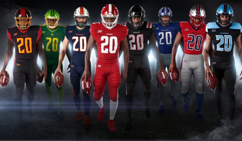
A few days ago, the XFL released the uniforms for all eight of their teams. Unlike the AAF, teams in the XFL will have a home and away uniforms. In this article, I will be ranking all jerseys from worst to best.
#8 DC Defenders

When DC’s uniforms were first unveiled my first initial thought was that’s it? They are just very basic all red uniforms and all-white uniforms. I do like the lightning bolt down the side of the pant leg but there just isn’t a whole lot here. The logo is just slapped on to the helmet with a simple white stripe running down the middle. Yes DC does have a simple color scheme but I was expecting a bit more from America’s Team.
#7 St. Louis Battlehawks


St. Louis Battlehawks arguably have the best helmet out of all of the XFL teams. It really sets itself apart from all of the other teams. Aside from that, there’s really not much there with this uniform set. The design on the shoulder pads is boring, to say the least. The whole layout of the jerseys just bores me.
#6 Tampa Bay Vipers
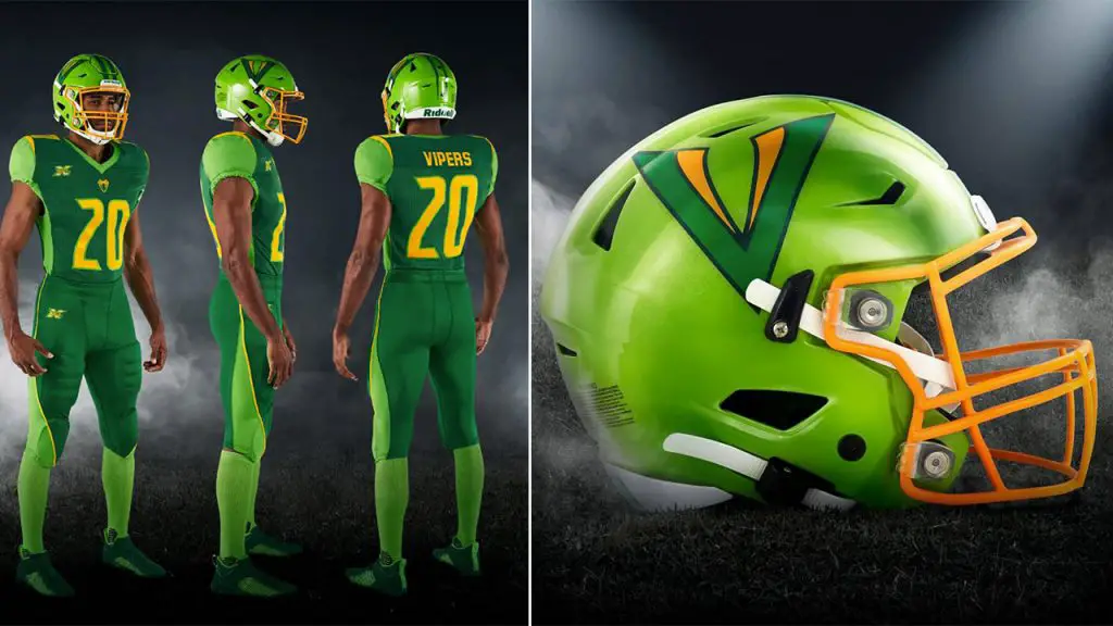
With the vipers uniform, you can see that a bigger color scheme can really make things a little bit more interesting. However, I do feel like the Vipers missed the mark with this uniform set. The lime green helmet really doesn’t sit well with me. I would have preferred a darker green helmet with the actual Viper logo on it instead of the simple V. Moving on there’s no design on the shoulder pads making it seem awkward. Two positive notes I will add is the subtle use of gold and the pants.
#5 New York Guardians
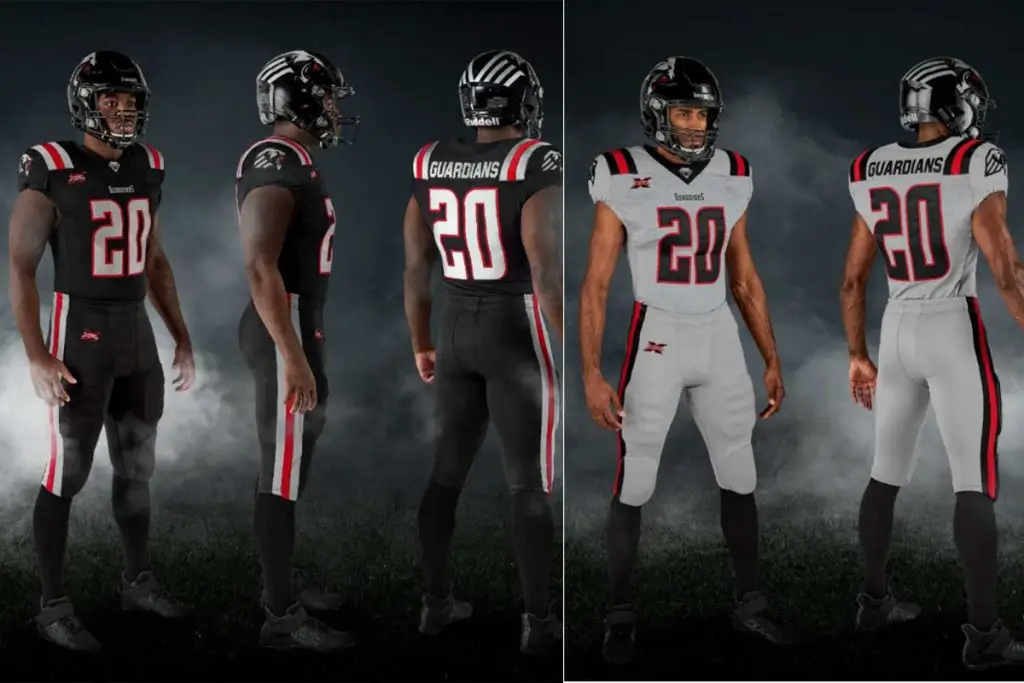
I feel like this is one uniform that isn’t really getting a whole lot of credit. the fact that it doesn’t have on the shoulder pads really sets it apart from other teams in my opinion. An interesting thing to note is that a concept Jersey from a few months ago is almost identical to the jersey that the XFL came out with.

I really like the use of the red in the jersey and the helmet is kind of interesting with the back stripes connecting but overall there are more impressive jerseys on this list.
#4 Dallas Renegades
Whenever I’m on Twitter all I hear is how great the Renegades uniforms are. I’m not saying they’re bad at all they do look good but I felt like I have seen the uniforms in the past. I couldn’t figure out where I had seen them until I was doing research for this article. It is almost identical to the default Madden 12 create-a jersey-setting.
If you would like to see the video:
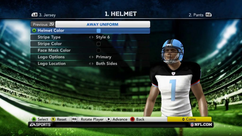
Yes, the uniforms are good but if they can be made in Madden 12 (a game from 8 years ago) then I don’t believe it deserves a spot in the top 3.


#3 Seattle Dragons
Looking at the positives, the sides of the helmet are amazing. I really like how they extended the logo all the way to the bottom of the helmet. One thing I’m not a big fan of however is the huge orange streak in the middle of the helmet. In my opinion, if they were to add something such as flames to the orange streak I could get behind it.

The all-white uniform looks great but I’m not a big fan of the all-blue uniform. The shoulder pads to me just feel empty. This uniform set is good but it’s one or two things away from being great.

#2 Houston Roughnecks

Let me just say whoever thought that the silver helmet would be a good idea definitely deserves a raise. It definitely fits with the whole roughneck persona that they’re trying to bring about. I really like the red uniforms. The star on the shoulder pads is a great touch as well. I’m not a big fan of the letter font but overall it’s a very good uniform set and definitely deserves its spot in the top three.

#1 Los Angeles Wildcats
From the social media comments I’ve read and the people I’ve talked to it seems as though I’m in the minority on this. Some may say that there’s no design on the shoulder pad which is true but the red and the orange go all the way down and fade Into claw marks down the pant leg which I think is a great touch.

The helmet also does the same thing in the middle and if I could say one thing I would prefer the middle streaks in the helmet to not be as big. On the all-black jerseys, the orange and the red go fantastic together and the white uniform isn’t half-bad either.

Well, those are my rankings for the XFL uniforms. Let us know in the comments what y’all think! these are my opinions and I would love to hear what y’all have to say. Remember this is the XFL where fans are above all!
Unleash the Action: Sign up for XFL Insider and Fuel Your Passion for Football!

USFL and XFL Merger: A Deep Dive into the Historic Collaboration
Latest Podcast
-


XFL Podcast
/ 1 year agoXFL-USFL Merger Insights: Houston’s Future, Draft News, Player Movement – Ep. 216
Welcome to Episode 216 of the “XFL Week In Review,” your premier destination for...
By Mark Perry


