Spring is rapidly approaching and so is the prospect of alternative football. Fan Controlled Football is set to kick off April 16 from Atlanta at historic Pullman Yards. Eight teams will be represented by various ownership groups sporting collaborative designs and team names determined by the fans themselves. Visual presentation has never been closely tied to the fans’ efforts. With that in mind, here is a look at the logos for the 2.0 iteration of FCF:
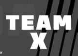
8. Shoulda Been (SB) Stars – Team X
The defending champions return for season 2.0 and have a new look to accompany their title defense. Formerly known as the Wild Aces, simplicity is the name of the game for Shoulda Been Stars which is under a new ownership group of Druski, Rachel Lindsay, Austin Ekeler, and an artificial intelligence program known as Altered State Machines (ASM). Fans are currently voting for what the new team logo will be. In the meantime, a placeholder text of “Team X” stands while the team still figures out its graphical presentation. It is inoffensive, but it doesn’t exactly inspire the masses either.
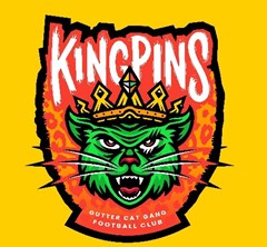
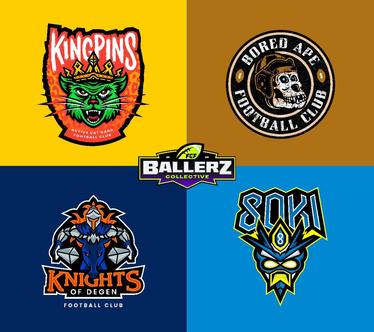
7. Kingpins
The Gutter Cat Gang are owners of this design and most certainly wanted their feline to look as embattled as possible. The squad’s name mixed with the team nme of Kingpins makes for an odd contrast in the design itself. This logo makes one wonder what the uniform combinations will look like with all of the clashing colors presented here. We will have to wait and see.
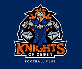
6. Knights of Degen
Purple and orange are risky colors to play with in jersey designs, but as far as logos go these end up making for solid contrast. The image of the knight galloping head-on is a particularly notable choice made by the artist here. The two swords aimed forward are a bit difficult to make out at first as they intial look to be arm extensons of the knights armor. The design itself is not a bad idea, just lacking a bit in execution.
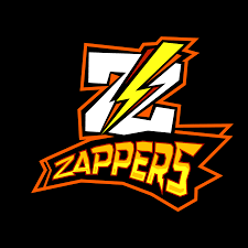
5. Zappers
The icon for the Zappers is akin to that of a protein bar. The yellow and faded brown mixed with the black and orange outlines makes it look like an energy supplement. Perhaps that’s the idea given the collective’s motto of “Getting Zapped” according to their team page. The electric bolt splitting the “Z” is a nice touch, though the color contrast is not nearly as memorable as say the Los Angeles Chargers’ iconic power blues and yellow bolts that have withstood the tests of time.
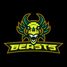
4. Beasts
The Beasts derive their name from Beast Mode himself, Marshawn Lynch. The logo itself represents some amalgamation of a lizard, bear, wildebeest, or whichever creature you want to portray. The lime green lettering brings Mountain Dew to mind upon impact, yet the font style gives an edge that the other logos’ typography styles do not have. The beast itself is bizarre as it is intimidating which gives it a unique flavor and may help separate the team and its ownership as a personality in this league.
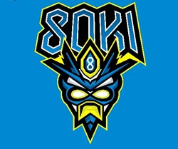
3. 8OKI
This design is emblematic of its team owners Steve Aoki and an anonymous art dealer. The character seems to portray Aoki as if he were some amphibious creature. If you are a follower of the world-renowned DJ you will appreciate this visual homage and perhaps even the diamond emblem with the 8 insignia on the creature’s head. It is certainly one of the more unique designs next to the Beasts, but it gets extra creativity points for representing a global icon while giving the team its official mascot.
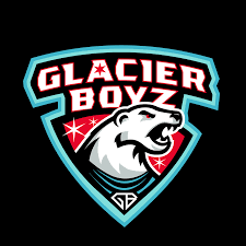
2. Glacier Boyz
Another returning squad from last season, the Glacier Boyz sport a threatening image with a voracious polar bear sporting a blue jersey. The red eyes of the bear as well as the background adorned with stars contrasts nicely with the light blue outline. Blood red, black red and light blue as a uniform combination remains to be seen as to how it looks on television, but the logo certainly spells an identity and a distinct profile.
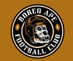
1. Bored Ape Football Club
This is the cleanest designs of the entire bunch. The ape skull coupled with the old-style football helmet gives the image a classic sheen to a menacing profile. The glowing blue eyes add an ominous look to the ape head as well. The “football club” used as an abbreviation FC may confuse first time viewers as to whether it’s a soccer or football squad, but the logo itself gets the message across clear as day.
Unleash the Action: Sign up for XFL Insider and Fuel Your Passion for Football!